DESIGN NAME:
Mirinda Vintage Special Edition
PRIMARY FUNCTION:
Beverage Packaging
INSPIRATION:
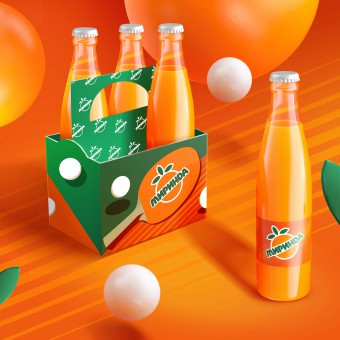
The goal for the Mirinda Vintage Special Edition was to highlight the brand’s heritage while keeping in mind relevance for today’s consumers. While designing this Special Edition, the PepsiCo Design Team ensured its elements were eye-catching for the Gen Z target audience, as well as generations already familiar with Mirinda. This sleek and simple Mirinda design borrows from vintage cues, but combines it with modern sensibility for an entirely new look.
UNIQUE PROPERTIES / PROJECT DESCRIPTION:
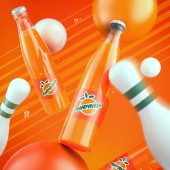
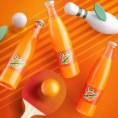
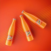
On the label, the instantly recognizable orange-shaped logo is front and center, with the Mirinda name spelled out in bubble-like vintage type uncharacteristic of modern day Mirinda. The glass bottles showcase the product and clean white bottle caps complete the throwback feel. In a society that revolves around ever-changing trends, Mirinda Vintage Special Edition offers a collectable opportunity, where fans can own a product that has withstood the test of time.
OPERATION / FLOW / INTERACTION:
-
PROJECT DURATION AND LOCATION:
-
FITS BEST INTO CATEGORY:
Packaging Design
|
PRODUCTION / REALIZATION TECHNOLOGY:
-
SPECIFICATIONS / TECHNICAL PROPERTIES:
-
TAGS:
-
RESEARCH ABSTRACT:
-
CHALLENGE:
-
ADDED DATE:
2022-02-25 22:38:38
TEAM MEMBERS (1) :
IMAGE CREDITS:
PepsiCo Design and Innovation, 2021.
|


