SberPay Payment Application by Sber |
Home > Winners > #137184 |
 |
|
||||
| DESIGN DETAILS | |||||
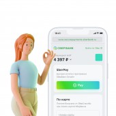
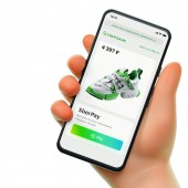
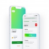
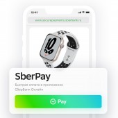
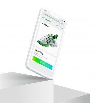
| DESIGN NAME: SberPay PRIMARY FUNCTION: Payment Application INSPIRATION: The project was created as a new convenient payment method. The task was to make a payment method that would simplify the user's life by eliminating the need to enter card details. It also had to be fast and secure. In preparation, market and user needs were also taken into account. Various methods of design and analytics were carried out, such as CJM, unit economics study, quantitative and qualitative research. UNIQUE PROPERTIES / PROJECT DESCRIPTION: Convenience - the buyer can see card balance before payment. Security - users pay for purchases through SberBank Online App. Card data is not transferred to stores and partners. Service - creation of a personal Internet acquiring account. Availability - all SberBank Online users can pay with SberPay. The visual language of SberPay is simple and easy to understand. The main communication is based on typography and familiar digital interface elements. OPERATION / FLOW / INTERACTION: One-time purchase. All payment channels are available. It is possible to use one-factor or two-factor payments. Recurrent payment. Subscription for regular debiting. It is possible to set up a trial period. Linking allows the user to save card data for future payments. An unlimited number of linked cards can be created. PROJECT DURATION AND LOCATION: The development of the project began in June 2021 and was completed in early September 2021 in Moscow. |
PRODUCTION / REALIZATION TECHNOLOGY: The design is based on the nature and values of the brand: innovation, confidence, reliability, individual approach, mobility, speed. Tone Of Voice and visual concept were also developed. The main features of SberPay are reflected using 3 main visual elements. Button reflects the ease of interaction and the usual pattern of behavior in the digital environment. Gradient is fluid and plastic. It reflects the brand's presence in the user's life, SberPay appears when needed and disappears when it fulfills its function. Typography is a simple and understandable business communication. SPECIFICATIONS / TECHNICAL PROPERTIES: Various graphic editors were used, such as Figma, Adobe Illustrator, and Adobe Photoshop. The capabilities of the ecosystem and the modification of a specially developed Sber API were used for technical development. As a result, digital products based on web applications and mobile applications were obtained. TAGS: innovation, payments, pay, acquiring, internetacquiring RESEARCH ABSTRACT: Research Objective. Test the relevance of SberPay by push or SMS in an online store. Research method. Remote survey, a click map. Target audience. older than 18, Pay for purchases mainly by card or by card and cash in an equal measure, made online purchases in the last year. Results. 62% would prefer to pay for an in-app purchase. Of them 54% simply answered that they would be able to pay by clicking on the push on their phone. The method is marked as convenient when using the phone, fast, since you do not need to enter card data, secure thanks to two-factor authentication. CHALLENGE: It was necessary to develop your own style, but be sure to take into account the global guidelines of the bank. As a result, a unique visual language was developed and the task of brand development was solved. ADDED DATE: 2022-02-25 14:39:55 TEAM MEMBERS (2) : Daria Prokuda and Shishki Collective IMAGE CREDITS: Sber, 2021. PATENTS/COPYRIGHTS: Sberbank |
||||
| Visit the following page to learn more: http://www.sberbank.ru/en/ | |||||
| CLIENT/STUDIO/BRAND DETAILS | |
 |
NAME: Sber PROFILE: SberBank is the largest bank in Russia, Central and Eastern Europe, and one of the leading financial institutions worldwide |
| AWARD DETAILS | |
 |
Sberpay Payment Application by Sber is Winner in Mobile Technologies, Applications and Software Design Category, 2021 - 2022.· Read the interview with designer Sber for design SberPay here.· Press Members: Login or Register to request an exclusive interview with Sber. · Click here to register inorder to view the profile and other works by Sber. |
| SOCIAL |
| + Add to Likes / Favorites | Send to My Email | Comment | Testimonials | View Press-Release | Press Kit |
Did you like Sber's Mobile Design?
You will most likely enjoy other award winning mobile design as well.
Click here to view more Award Winning Mobile Design.


