DESIGN NAME:
Rely on Hydrogen
PRIMARY FUNCTION:
Corporate Identity
INSPIRATION:
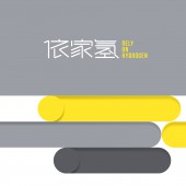
Rely On Hydrogen is a high-tech enterprise focused on the field of biotechnology and aim at the R&D of hydrogen water health care products. After sufficient research, the brand logo is designed in the form of Chinese characters, inspired by the circuit lines of the product and the traditional Chinese water hexagram graphics. In the creative execution, the commonality of 'lines' between each other is extracted and visually integrated to create a visual system with brand attributes and personality.
UNIQUE PROPERTIES / PROJECT DESCRIPTION:
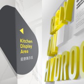
Due to the large visual difference in the glyph structure of the brand's Chinese name, in order to ensure the recognition quality and aesthetics of the text, the thickness of the Chinese characters and the inclination of the strokes were unified in the design and execution, so that the strokes of the Chinese fonts have a tight and appropriate structure and a uniform white color. Even, sloping lines convey the brand's aggressive attitude, while rounded corners convey gentleness and tolerance. The smooth and orderly lines make the overall vision more personal and fashionable, giving the brand new temperament and connotation.
OPERATION / FLOW / INTERACTION:
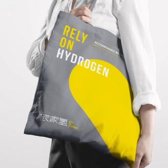
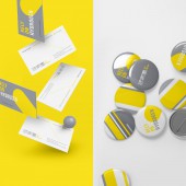
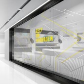
The new brand colors have also been carefully selected, with extreme gray and bright yellow as the main colors, injecting a touch of warmth into the brand, which reflects the protection the product brings to consumers, and intuitively shows the company's vision and culture. The new brand image runs through the plane vision and space display with 'lines', and its line tension with a certain degree of expansion not only balances and coordinates all areas of the exhibition hall, but also allows a more complete interpretation of the new brand concept and visual extension.
PROJECT DURATION AND LOCATION:
The project started in March 2021 in Guangzhou and finished in May 2021 in Guangzhou, and was exhibited in June 2021 in Guangzhou.
FITS BEST INTO CATEGORY:
Graphics, Illustration and Visual Communication Design
|
PRODUCTION / REALIZATION TECHNOLOGY:
To create a consistent visual system, all the necessary PMS color codes were provided for printed and digital media. In addition, RAL equivalents of these colors and fabric colors were also selected for the interior space.
SPECIFICATIONS / TECHNICAL PROPERTIES:
The logo and visual system are designed in vector format to make it suitable for different sizes of digital and printed media. In order to prevent the mis-production of any items, we have prepared a comprehensive brand logo guidelines manual.
TAGS:
Logo, Branding, Visual Identity, Graphic Design, Interior Design
RESEARCH ABSTRACT:
The study found that as contemporary young people gradually become the main force of consumption, their attention to personalized health products is also increasing, and they understand the visual and cultural output of brands. Therefore, 'Rely On Hydrogen', which is deeply engaged in the fields of big health and hydrogen molecular medicine, needs to redefine the differentiated attributes of its brand identity to connect its past and future. And accept cultural differences in various regional markets to convey the brand's corporate culture and style.
CHALLENGE:
The key challenge was convincing clients to take a bolder design direction. Through many discussions, the client recognized the potential of the project and had the courage to go beyond the conservative culture of the industry. How to rationally arrange the new visual elements and space, so that the product can produce the best display effect in a limited space, to let the experiencer have a deeper understanding of the brand from all aspects.
ADDED DATE:
2022-02-25 10:16:41
TEAM MEMBERS (2) :
Creative Director: Zhiji Dong and Designer: Lu Gu
IMAGE CREDITS:
Guangzhou Cheung Ying Design Co. Ltd., 2021.
|
