Free Brand Identity by Fengnan Lin |
Home > Winners > #135862 |
 |
|
||||
| DESIGN DETAILS | |||||
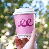
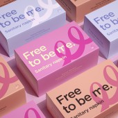
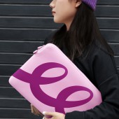
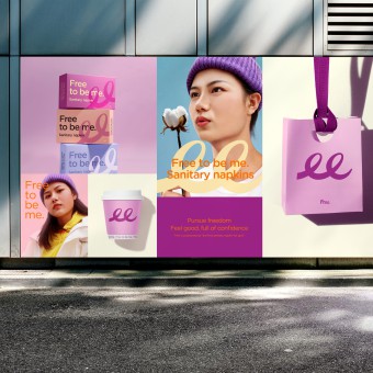
| DESIGN NAME: Free PRIMARY FUNCTION: Brand Identity INSPIRATION: For more than 10 years, Free's brand position-"takin UNIQUE PROPERTIES / PROJECT DESCRIPTION: The letter "F" rises slightly, reflecting a young and optimistic attitude. The continuous brush design of the two "e" letters are cleverly linked together which has also become the super symbol of Free, and used to create specifications such as the Icon system, that makes the brand more unified and more extensible, and also makes Free's brand vision stand out from the competition. OPERATION / FLOW / INTERACTION: The "ee" is extracted from the original Logo, which reflects the modern women's feeling of unrestrained, the pursuit of freedom and self-expression through the dynamic line performance. PROJECT DURATION AND LOCATION: Guangzhou,Guangdong Province,China,July 6,2021 FITS BEST INTO CATEGORY: Graphics, Illustration and Visual Communication Design |
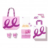
PRODUCTION / REALIZATION TECHNOLOGY: Extract "ee" from the logo as an auxiliary graphic and apply it to many work scenarios, such as business cards, express boxes, badges, document bags, messenger bags, canvas bags, etc. The process involves four-color printing and baking paint process. SPECIFICATIONS / TECHNICAL PROPERTIES: Business card 54mmx90mm Badge 54mmx85mm Document bag 280mmx180mm Canvas bag 580mmx390mm TAGS: Brand visual upgrade, Sanitary napkins, GEN Z, RESEARCH ABSTRACT: We found that for more than 10 years, Free has been "taking the first sanitary napkin for girls" as its brand positioning. The brand image is gradually aging, making it difficult for the brand to continue to gain the recognition of the "youngest" consumer group. CHALLENGE: Through the brand visual upgrade, an old brand of daily necessities is reshaped into a trendy brand of sanitary napkins with a young attitude, conveying freedom and a brand-new attitude image to consumers. ADDED DATE: 2022-02-15 14:22:30 TEAM MEMBERS (3) : Fengnan Lin, Yingqiang Zhang and Xiaofang Teng IMAGE CREDITS: Fengnan Lin, 2021. |
||||
| Visit the following page to learn more: http://m6z.cn/68LJTm | |||||
| AWARD DETAILS | |
 |
Free Brand Identity by Fengnan Lin is Winner in Graphics, Illustration and Visual Communication Design Category, 2021 - 2022.· Press Members: Login or Register to request an exclusive interview with Fengnan Lin. · Click here to register inorder to view the profile and other works by Fengnan Lin. |
| SOCIAL |
| + Add to Likes / Favorites | Send to My Email | Comment | Testimonials | View Press-Release | Press Kit |

