DV Prestige Aesthetic Clinic by Watsonkoay |
Home > Winners > #134868 |
 |
|
||||
| DESIGN DETAILS | |||||
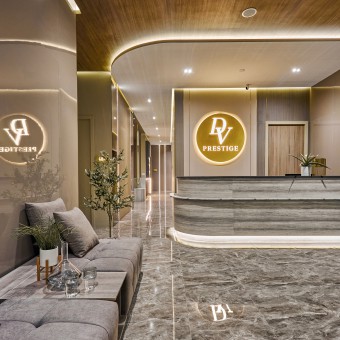
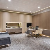
| DESIGN NAME: DV Prestige PRIMARY FUNCTION: Aesthetic Clinic INSPIRATION: Our approach was to create a sense of belonging not only for the patients but also the staff at the clinic. Through our design, we hope to deliver a sense of not only tranquillity but also some level of professionalism to highlight quality to customers. We wanted to combine the ambience of a spa with the clean and pristine impression of a trusted clinic. UNIQUE PROPERTIES / PROJECT DESCRIPTION: From smooth and glistening walls to clean and simple furnishings this elegant beauty clinic brings about a soft ambience of modern and minimal luxury. Natural in light and earthy in color, it is a comforting abode that welcomes all visitors to feel relaxed and truly at ease. OPERATION / FLOW / INTERACTION: The health and wellness industry has transformed majorly in the past few years. When something is attracting a lot of attention, it means there are a lot of players in the industry.The best way to do this is of course at the physical clinic where you want your client to step in and immediately feel at ease at the clinic and know that they have come to the right place to seek the treatment they require. It can be conveyed as an approachable and warm ambience that can in fact contribute to the treatment by putting the customer in a serene mood to better experience their treatment. PROJECT DURATION AND LOCATION: The project started in October 2021 in Malaysia and finished in December 2021 in Malaysia. FITS BEST INTO CATEGORY: Interior Space and Exhibition Design |
PRODUCTION / REALIZATION TECHNOLOGY: The panels, mirrors and cabinets have been fitted with LED lights that direct the focus on the client and prove to them that they are the salons most valued feature, as well as setting a mood that evokes creativity and attentive skilled work. Fine and subtle lines stream throughout the layout to symbolize once more that this clinic is all about the people. SPECIFICATIONS / TECHNICAL PROPERTIES: This Project size is around 3000mm x 760mm, 360 square meters. TAGS: earthy, minimal luxury, natural, luxury, biophilic, relax, invigorate, stylistic RESEARCH ABSTRACT: Like all of our work, the work started with initial consultation with the client to find out what the requirements were. Then it was off to moodboards, online research for ideas and inspiration, putting these images together to create the right look and feel, and then to start the ID process of planning, drawing and executing. To make sure we get the right look and feel, we of course ran it by our client but also spoke to those who regularly visited such places to get their ideas and find out what they seek in terms of choosing the clinic they want to visit. CHALLENGE: The hardest part was to pinpoint exactly the approach we wanted for our client. Naturally, as interior designers, we want to approach this project as creatively as possible but we also had to keep our clients branding in mind. Being too creative or too outlandish in the design can instead make the setting cold and unapproachable. Therefore, the challenge was to find that fine balance between aesthetics and professionalism for our customer. ADDED DATE: 2022-01-22 03:59:59 TEAM MEMBERS (1) : IMAGE CREDITS: CY Wong |
||||
| Visit the following page to learn more: http://bit.ly/3Asa5MR | |||||
| AWARD DETAILS | |
 |
Dv Prestige Aesthetic Clinic by Watsonkoay is Winner in Interior Space and Exhibition Design Category, 2021 - 2022.· Press Members: Login or Register to request an exclusive interview with Watsonkoay. · Click here to register inorder to view the profile and other works by Watsonkoay. |
| SOCIAL |
| + Add to Likes / Favorites | Send to My Email | Comment | Testimonials | View Press-Release | Press Kit |


