DESIGN NAME:
Plant Selected
PRIMARY FUNCTION:
Beverage
INSPIRATION:
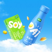
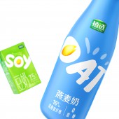
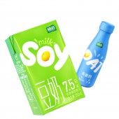
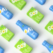
The overall design should always be on trend. To stand out on shelf, packaging should have impactful color. Therefore we take green and blue for each product, which are also relevant to soya and oat respectively. As a global trendy category, it is better to add international feel to products. Thus, we create a visual hammer by using graffiti-style English font. The gold soya and oat within the product name reinforce the vitality of vegan nutrition. The product benefits are integrated and presented at the bottom to ensure consumers its quality.
UNIQUE PROPERTIES / PROJECT DESCRIPTION:
Plant-based milk alternative is a trendy category in China. Used to be a soy milk expert, Plant Selected decides to fulfill its portfolio by add more plant based products. To follow the global vegan trend, Plant Selected should have a new look to differentiate from local plant milk brands offering single plant-based products. Therefore, an English visual hammer is created to enhance its international feel.
OPERATION / FLOW / INTERACTION:
Plant drink is popular in China, but most of the brands only provide single plant-based product such as soya only or almond only. To jump out of the category, Plant Selected starts to offer plant-based products covering more plant bases. To express the exotic feeling, we treat product name into graffiti-style font and integrate soya and oat into it. Besides, the strokes around leverage the vitality. A fully colored background creates impactful color block on shelf. Eac product's RTBs are clearly presented at the bottom to ensure consumers the product is good.
PROJECT DURATION AND LOCATION:
The project started in September, 2020 and the product is launched in March, 2021
FITS BEST INTO CATEGORY:
Packaging Design
|
PRODUCTION / REALIZATION TECHNOLOGY:
PET bottle covered with Matte film
SPECIFICATIONS / TECHNICAL PROPERTIES:
Width 60 mm x Depth 60 mm x Height 177 mm
TAGS:
Packaging, plant-based Beverage, plant milk, China
RESEARCH ABSTRACT:
To occupy the new category, we take a look at the international market where plant milk category is quite mature. We find out many international plant milk brands start communicating a trendy lifestyle instead of flavor on packaging. Thus we uses graffiti-style font to add casual touch to product. A large product name in English leverages the premium and exotic feel. The fully colored background creates a powerful color block on shelf and the gold soya and oat become a catchy point on packaging which can draw consumers' attention.
CHALLENGE:
We need to find a way to differentiate Plant Selected from traditional plant-based brands. To overcome this challenge, we bring the international and vital feel to products. We create a visual hammer for the product by combining product name and grins. The large English word can stand out among other plant-based drinks on shelf. Its fully colored background can also attribute to the shelf impact.
ADDED DATE:
2021-12-31 08:10:43
TEAM MEMBERS (5) :
Creative Director: Yang LI, Designer: Feiteng WAN, Managing Director: Lei ZHANG, Strategic Planner: Xincheng ZHUANG and 3D rendering: Jianhui CHEN
IMAGE CREDITS:
Blackandgold Shanghai, 2021.
PATENTS/COPYRIGHTS:
All photos and video credits to blackandgold Shanghai, 2022.
|


