DESIGN NAME:
Small Satine
PRIMARY FUNCTION:
Kid Milk
INSPIRATION:
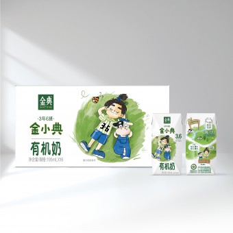
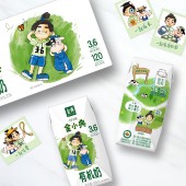
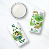
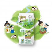
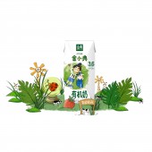
IP character can attract kids' attention and enhance childish delight. Instead of using IP collaboration, we created an IP for it. He is a pupil from Third Grade Class 6 implying 3.6g/100ml protein. To express the natural environment, IP character is hanging out with the calf on the grass. The back panel shows the panorama of dairy farm to communicate good milk from good farm. Its nutrition claims are highlighted for parents' trust.
UNIQUE PROPERTIES / PROJECT DESCRIPTION:
For new middle-class in China, they focus more on their kids' health compared with their previous generation. Satine advocates natural and organic life. Now, Satine enters the kid milk market with its newly-launched organic kid milk named after Small Satine. Small Satine has its own IP to draw kids' attention. The illustration of his exploration in dairy farm is the theme of design. it also demonstrates the harmony with nature.
OPERATION / FLOW / INTERACTION:
Satine is a well-known brand in China. Its white and green combination is quite iconic. When the brand extends to kid milk, its logo and color tone need to be retained. The sub-brand name Small Satine is below Satine logo. The main visual is Small Satine hangs out with calf and they are lying on the grass leisurely. It communicates the environment and the harmony with nature.
PROJECT DURATION AND LOCATION:
The project started in Feb, 2021 and the product is launched in June, 2021.
FITS BEST INTO CATEGORY:
Packaging Design
|
PRODUCTION / REALIZATION TECHNOLOGY:
Inner pack: Tetra Pack
Box: paper
SPECIFICATIONS / TECHNICAL PROPERTIES:
Inner pack: Width 43mm x Depth 41mm x Height 102mm
Box: Width 265mm x Depth 22mm x Height 135mm
TAGS:
Packaging, milk, kid, China, organic
RESEARCH ABSTRACT:
Satine is a premium milk brand. It talks about nature and organic. When it comes to kid milk, the design language should be appropriate to kid. After looking at kid food and drink, we find out IP characters are often used. Thus the illustration is created to tell a story that Small Satine is exploring the dairy farm. It symbolizes the harmony with nature as well as good farm environment.
CHALLENGE:
Satine is a premium organic milk brand. The main challenge is how to add childish delight to a premium product. By doing so, the overall look and feel of Satine is maintained. Based on the combination of white and green, an illustration was created. The product name organic milk has switched to a childish font. On back panel, the introduction of dairy farm is also treated in a cute way.
ADDED DATE:
2021-12-28 08:53:02
TEAM MEMBERS (5) :
Creative Director: Yang LI, Designer: Xuying ZHANG, Illustrator: Yinlu YU, Managing Director: Lei ZHANG and Strategic Planner: Xincheng ZHUANG
IMAGE CREDITS:
Blackandgold Shanghai, 2021.
PATENTS/COPYRIGHTS:
All photos credits to blackandgold Shanghai, 2022.
|
