|
|
|

|
|
| DESIGN DETAILS |
DESIGN NAME:
Better Bodies Hi
PRIMARY FUNCTION:
Brand Identity
INSPIRATION:
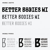
Normally, the weight of a typeface changes, but its skeleton does not change significantly. For a long time, I have been wondering if it is possible to create a typeface whose skeleton also changes when its weight changes. Also, in general signage projects, the typeface used is limited in order to give a sense of unity to the space, but I was wondering if it would be possible to change the typeface to match the function of the space. These two ideas became the inspiration for this design.
UNIQUE PROPERTIES / PROJECT DESCRIPTION:
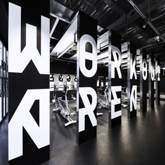
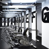
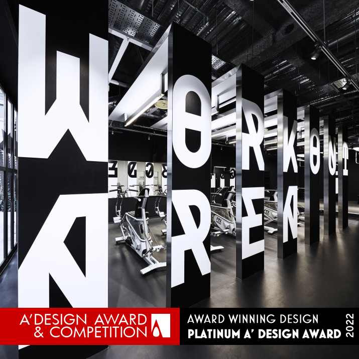
Better Bodies Hi is a workout studio. They needed to create an environment where users after work could gradually prepare their body and mind towards exercise. Therefore, they designed a typeface that transforms in three stages. As users move from the reception to the workout area, the typeface of the sign gradually changes to a thicker and larger. The typeface gradually guides and encourages the user to work out. They used this typeface in logo, website, and products, to create a brand identity.
OPERATION / FLOW / INTERACTION:
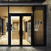
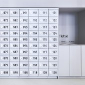
It is impossible for a user who has just returned from working in an office to start training hard right away. It is necessary to gradually prepare the body and mind. For this reason, the sign at the reception desk is small and modest. The locker sign is a little larger. Signs in the workout area are very large. By changing the signs according to the user's situation, the user can gradually become more prepared.
PROJECT DURATION AND LOCATION:
The project started in November 2018 and opened in Aoyama, Tokyo in March 2020.
FITS BEST INTO CATEGORY:
Graphics, Illustration and Visual Communication Design
|
PRODUCTION / REALIZATION TECHNOLOGY:
A typeface that transforms in three stages was developed for this project. As that typeface gradually gets thicker, the diagonal lines increase, giving it a more lively look. In the reception area, the thinnest typeface is used sparingly to create a relaxed atmosphere. In the workout area, the boldest typeface is used at a size of more than one meter to encourage users. The use of different typefaces depending on the user's situation contributes to the quality of the user's experience.
SPECIFICATIONS / TECHNICAL PROPERTIES:
This specialized typefaces has been used for everything from small application icons to institutional signage up to 1045mm in height. It has also been displayed in a variety of ways, from printed materials to digital signage, cutting sheets, and acrylic.
TAGS:
Brand Identity, Branding, Visual Identity, Logo, Signage, Typeface, Experience
RESEARCH ABSTRACT:
-
CHALLENGE:
In Japan, advertisements for gyms often use pictures of very fit Westerners. Of course, Japanese do not become Westerners as a result of workout. BETTER BODIES HI conveys the message that you can improve your body and your life by making incremental changes to your current self. Therefore, They have visualized the "change". The difficulty was in managing the three different typefaces. They designed guidelines and format data so that the client could operate the typeface themselves.
ADDED DATE:
2021-12-03 06:33:12
TEAM MEMBERS (3) :
Takahiro Eto, Takaaki Nakamura and Shizuka Iijima
IMAGE CREDITS:
Takahiro Eto, 2021.
|
| Visit the following page to learn more: http://bit.ly/3HjWZDq |
|
| CLIENT/STUDIO/BRAND DETAILS |
 |
NAME:
Better Bodies Hi
PROFILE:
BETTER BODIES HI is a workout studio located in Aoyama, Minato-ku, Tokyo. Its goal is to change the bodies and lives of its users for the better through short, high-impact workouts. This studio opened on March 1, 2020. About a month later, a state of emergency was declared and the studio was closed for a while, but it is still in operation.
|
| NOMINATION DETAILS |
 |
Better Bodies Hi Brand Identity by Takahiro Eto is a Nominee in Graphics, Illustration and Visual Communication Design Category.· This project is currently confidential as results have not been announced yet. Images and further details of the project is not available for public yet, please check back later. If you are the owner of this design, please login to view the images.
· The profile and other works by Takahiro Eto is also kept secret. This information will also be available later.
|
|
|
| COMMENTS |
| Giulia Esposito |
Comment #14923 on December 27, 2022, 10:34 pm |
|
I am absolutely delighted to witness the success of "Better Bodies Hi" in the field of graphics, illustration and visual communication design. This work is a strong testament to the impressive creativity of its designer and its impactful design is truly captivating. It is a prime example of how design can be used to communicate a unique message with its bold and distinctive graphics. This work will undoubtedly make a strong statement in the industry, which is why I am so pleased to see it rewarded with the prestigious A' Design Award. Congratulations to Takahiro Eto for this remarkable achievement!
|
| Walter Graham |
Comment #19782 on January 3, 2023, 6:12 am |
|
I'm in awe of Takahiro Eto's creative and innovative design for Better Bodies Hi! Their use of a typeface that transforms in three stages to gradually guide and encourage users to work out is truly inspiring. What's even more impressive is that the typeface's skeleton also changes when its weight changes! This level of detail and thoughtfulness is truly remarkable, and I'm so glad that it has been recognized with the Platinum A' Design Award. Takahiro Eto should be incredibly proud of their accomplishment, and I'm sure they will continue to create amazing designs in the future. Well done!
|
| Stefano Moretti |
Comment #24574 on January 3, 2023, 7:44 am |
|
This award-winning work is an excellent example of creative design, with a unique typeface that transforms in three stages to guide and encourage the user. The use of different typefaces depending on the user's situation adds to the user's experience, creating an environment for preparing their body and mind for exercise. This design is truly an outstanding example of good design.
|
| Thomas Anderson |
Comment #40764 on January 3, 2023, 1:11 pm |
|
Kudos to the designer behind the award-winning work 'Better Bodies Hi'! This creative project is a great example of how design can be used to encourage and guide users. The idea of a typeface that changes in three stages as users move from the reception to the workout area is truly remarkable and speaks to the potential of graphic design to influence behavior. The use of this typeface in logo, website, and products to create a cohesive brand identity further demonstrates the designer's skill in creating a unified brand. This work is an inspiring example of how design can be used to create meaningful experiences and has rightly been recognized for its excellence.
|
| Patricia Miller |
Comment #45266 on January 3, 2023, 3:03 pm |
|
Takahiro Eto's award-winning design of a transforming typeface, which gradually guides and encourages users to workout, is truly an outstanding example of good design.
|
| Paul Phillips |
Comment #74623 on January 4, 2023, 4:55 am |
|
It's amazing to see how a simple typeface can be used to create an environment that encourages exercise. Takahiro Eto's work on the Brand Identity of Better Bodies Hi is a great example of how thoughtful design can be used to motivate people. The transformation of the typeface from the reception to the workout area is a subtle but powerful visual cue for users to get ready for their workouts. Takahiro Eto's work is a great example of how design can be used to create positive experiences and it is no surprise that they have been awarded for their excellent work.
|
| Elena Petrenko |
Comment #77887 on January 4, 2023, 6:34 am |
|
This award-winning work is a thoughtful and creative brand identity that successfully encourages and engages users with its transforming typeface.
|
| Hien Nguyen |
Comment #80931 on January 4, 2023, 8:23 am |
|
I am truly impressed with Takahiro Eto's award-winning work, "Better Bodies Hi". His remarkable achievement in Graphics, Illustration and Visual Communication Design is commendable and truly inspiring.
|
| Haruka Abe |
Comment #82424 on January 4, 2023, 9:23 am |
|
Congratulations to Takahiro Eto for creating an outstanding brand identity with "Better Bodies Hi" that earned the prestigious Platinum A' Design Award.
|
| Chloe Turner |
Comment #91190 on January 4, 2023, 5:47 pm |
|
I'm so impressed by the innovative design of 'Better Bodies Hi'. This typeface is truly unique in that its skeleton also changes with its weight - something no one has done before! It's fantastic that Takahiro Eto managed to find a way to create a typeface that can be adapted to fit the function of any space. It's truly extraordinary that this typeface has been recognised for the A' Design Award. Takahiro Eto should be applauded for their fantastic work on 'Better Bodies Hi'!
|
|
|
Did you like Takahiro Eto's Graphic Design?
You will most likely enjoy other award winning graphic design as well.
Click here to view more Award Winning Graphic Design.
Did you like Better Bodies Hi Brand Identity? Help us create a global awareness for good graphic design worldwide. Show your support for Takahiro Eto, the creator of great graphic design by gifting them a nomination ticket so that we could promote more of their great graphic design works.
|
|
|
|
|
|
