DESIGN NAME:
Between The Silhouettes
PRIMARY FUNCTION:
Residential Apartment
INSPIRATION:
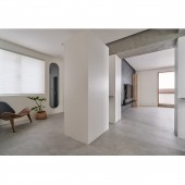
Inspired by the silhouettes of the homeowner and his child as they play in the woods in the sun, the design uses existing pillars and beams in this 50 year old building and spaces between cabinets to create seemingly spontaneous lines of sight and interactions, echoing the scenic view and arrangement of trees in the neighboring park.
UNIQUE PROPERTIES / PROJECT DESCRIPTION:
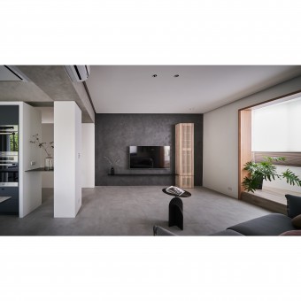
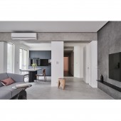
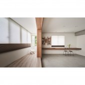
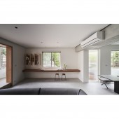
By shifting and adjusting the layout, this design greatly improved both the natural lighting and ventilation in this space. The balcony, which is located on the side of the living room, has become a stage for the child. The cabinets, with clean lines and simple colors, are separated from the ceiling and beams, so while they define and divide the spaces in the house, just enough opening is left for the lines of sight to meet the rays of sunlight as they sprinkle in.
OPERATION / FLOW / INTERACTION:
-
PROJECT DURATION AND LOCATION:
The project started in March 2020 and finished in October 2020 in Taipei, Taiwan.
FITS BEST INTO CATEGORY:
Interior Space and Exhibition Design
|
PRODUCTION / REALIZATION TECHNOLOGY:
With a circular flow, the common area retains some flexibility for potential changes in configuration. By slightly separating the cabinets from the ceiling and beams and creating some gaps, the design allows for the mingling of lines of sight and beams of light. There are shelves in the midsection of the cabinets for books or other decorative items on display, and some of the beams are designed with slight angles so that they appear less oppressive or overbearing. Furthermore, the design is made with the homeowners health and allergies in mind, so only materials and paints that are low in formaldehyde are used, and all the facades are designed with clean lines and flat surfaces, which make them easy to clean and maintain, thus minimizing risks of allergic reactions.
SPECIFICATIONS / TECHNICAL PROPERTIES:
Using pure white as the main color against the backdrop of illuminating natural light and outdoor greens, combined with a material known as LOTOS and black kitchen appliances, a layered depth of field with warm textures is generated. The open common area is centered on the interactions between the family members, while still retaining flexibility for other occasions or functions such as gatherings, performances by the child, reading and doing yoga. The gaps between the cabinets and the beams linger in the hallway and allow lines of sight to mix with all the lights and shadows.
TAGS:
Interior, Design, Residence
RESEARCH ABSTRACT:
The open concept design, combined with views of the greenery from the park, is perfect for all the activities that the child needs as well as the comfort of the entire family. The parents can always keep an eye on the movement and safety of the child. The open space and flow provide more freedom in the placement of different pieces of furniture, and the balcony, which is raised, becomes the familys stage. Changing the layout from 4 bedrooms to 3 also means that each room now has significantly better functionality.
CHALLENGE:
The 50 years old building was plagued by issues such as structural tilt, dilapidated pipes, efflorescence on the walls, and an outdated layout. Hence, foundational work has to be done for the renovation in order to ensure safety, and layout has to be adjusted to create ample lighting and sufficient ventilation for the entire space, so that the family may enjoy a healthy and natural lifestyle.
ADDED DATE:
2021-11-22 09:06:53
TEAM MEMBERS (1) :
IMAGE CREDITS:
Hey Cheese Photography Studio
|
