DESIGN NAME:
Purity
PRIMARY FUNCTION:
Residential House
INSPIRATION:
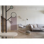
The design is centered on the common life style of parenting and working, abandoning complicated techniques and colors. Through simple and pure design thinking, the design also solves the architectural defects of old houses, creates appropriate openness and privacy, and then injects space conditions such as lighting, storage, and functions to depict a fresh and stress-relieving parent-child interaction space.
UNIQUE PROPERTIES / PROJECT DESCRIPTION:
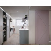
Because the owner is engaged in online e-commerce work and has school-age children, a lot of space for of cargo storage, office area, and product shooting is required. In addition, daily interaction space with children needs to be considered. The designer opens the part of the kitchen wall to introduce light and a sense of openness, while implants reading, work and other functions. Supplemented by soft tones and arc design, a childlike atmosphere of parent-child interaction is created.
OPERATION / FLOW / INTERACTION:
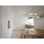
Through the effective partition of storage, public areas such as the living room, kitchen, are more spacious and comfortable.Through the opening of the wall, lighting is introduced into the dining and kitchen area, users can also talk and interact at any time, take care of the children's situation, and expand the function of the kitchen island. The other side of the kitchen is planned as a working area. Combined with magnetic baking glass and blackboard wall, it can be used as office notes, children's creation and painting and other activities to promote the interaction between parents and children.
PROJECT DURATION AND LOCATION:
The project started in May 2019 and finished in October 2019 in Taipei city.
FITS BEST INTO CATEGORY:
Interior Space and Exhibition Design
|
PRODUCTION / REALIZATION TECHNOLOGY:
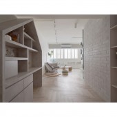
Instead of the design thinking of independent storage rooms, the designer follows the functional requirements of each area and the types of items placed, such as goods, clothing, daily necessities, toys, etc., and distribute storage methods in various spaces such as the porch, living room, couch, kitchen and bedroom private areas, and greatly increase storage capacity. At the same time, the indoor thick beams and columns are hidden to create a refreshing and comfortable space scene.
SPECIFICATIONS / TECHNICAL PROPERTIES:
It is a 148.5-square-meter house with two rooms.
TAGS:
Interior, Design, House, Residence
RESEARCH ABSTRACT:
In order to improve use efficiency and storage capacity, the designer rejects to set up a single storage area, but arranges the hallway, living room, couch, kitchen and bedroom private areas according to needs and types of objects, and also makes good use of the storage area to hide the thick beams. The creation of a living space for parent-child interaction is also the focus of the planning of this case.
CHALLENGE:
In response to the needs of work and childcare, how to combine storage efficiency and style aesthetics without affecting the comfort of the space, and integrate a large number of storage functions into the home life in a simple and natural way is the design focus of this project.
ADDED DATE:
2021-11-04 04:34:10
TEAM MEMBERS (1) :
Wu Yi Lun
IMAGE CREDITS:
Yi Lun Wu, 2021.
|


