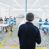
Aesthetic Lab Classroom by Pei Ting Yu |
Home > Winners > #132502 |
 |
|
||||
| DESIGN DETAILS | |||||
| DESIGN NAME: Aesthetic Lab PRIMARY FUNCTION: Classroom INSPIRATION: The first step of the transformation process was making the space a blank canvas. Encompassed by white interior walls and ceilings, children’s rich and diverse imaginations are able to run freely. Furthermore, in order to give students a more complete and pure visual experience, the colors of the space were strictly controlled, with all of the facilities and equipment inside the classroom rendered white. UNIQUE PROPERTIES / PROJECT DESCRIPTION: The value of aesthetic education courses is gradually becoming acknowledged in education circles. We lead the way in advocating the transformation of classroom spaces for the purposes of aesthetic education and came up with the concept of Aesthetic Lab. The hope is that the classroom will become a place for student’s to seek and explore aesthetics knowledge, turning it into a receptacle for the chemical reaction between rational knowledge and perceptual imagination. OPERATION / FLOW / INTERACTION: The only colors that were left to flow throughout the space were the four primary colors. The colors flowing down from the ceiling are the visual focal point of the entire space. The central island integrates water faucets, outlets, storage space, and other functions in the center of the classroom. The purpose of centralized storage is to return the space to the users by maximizing the usage area and accommodating the moving of student desks and folding chairs used for meeting the needs of different course requirements. For example, the space appearance can be rearranged freely for the usages of small group creation, lectures, and exhibitions. During the modification of storage spaces, teachers were also advised to cooperate in using storage boxes to classify teaching materials and equipment. The placement of the storage boxes can be adjusted according to size and frequency of use in order to more effectively utilize teaching materials and avoid unnecessary clutter. Students can also use the top of the central island’s storage cupboard as a tabletop for project operations such as editing projects. Additionally, it can be used as a platform for the display of projects at semester-end exhibitions, wherein upon students’ replacing of the ceiling’s rail-mounted lights with projection lights to illuminate their projects, the classroom is transformed into an exhibition space. It is hoped that through the presentation of works in the exhibitions, students can achieve a new level of experience in aesthetics learning, and even connect it with life experiences. PROJECT DURATION AND LOCATION: The project completed in January 2021 in New Taipei City , Taiwan FITS BEST INTO CATEGORY: Interior Space and Exhibition Design |
PRODUCTION / REALIZATION TECHNOLOGY: The space adheres to the visual composition techniques of equal balance, centering, and symmetry, and applies the golden ratio to the dimensions of the items inside the classroom. While intangible concepts are conveyed to students, the flowing lines on the floor are a manifestation of the knowledge applied within the space. The four colors draw out the central axis of the space and the golden ratio, doubling as teaching materials for aesthetics exploration in the classroom. And since this classroom has already been imbued with rich knowledge, it is up to the students to come in and make discoveries. SPECIFICATIONS / TECHNICAL PROPERTIES: 110m2 TAGS: Interior, Campus, Classroom, CMYK, Children, School, RESEARCH ABSTRACT: We started off by studying the context of the development of aesthetics education in the curriculum of junior high and elementary schools in Taiwan. We found that what was most lacking was contact with aesthetics in daily life. Moreover, discussions with school officials revealed that aesthetics courses have become more and more diversified in recent years, extending beyond simply drawing pictures. Therefore, our design objective was to make this classroom a space that opens up more possibilities for the future. We also hoped that this classroom itself could serve as a teaching tool through which students can personally experience aesthetics. While in this space, students would be able to perceive the aesthetics principles that were purposely applied and also learn the concept that aesthetics coexists with rationality and sensibility. An additional objective was to do away with the students’ preexisting impressions of classrooms. CHALLENGE: Communicating with the school took quite a bit of time. Our plan called for the placement of a six-meter central island and sink in the middle of the classroom, a design element that smashed people’s preexisting impressions of classrooms. But the main reason why discussions took so long was the break with convention in terms of layout and material usage. Thus, during initial discussions, there was a lot of apprehension about the classroom’s functionality, safety, and future maintenance, and we had to dedicate some time to building everyone’s confidence. ADDED DATE: 2021-10-30 08:58:20 TEAM MEMBERS (1) : Director: Yu, Pei Ting IMAGE CREDITS: Image : Photographer Jason Chen |
||||
| Visit the following page to learn more: https://www.behance.net/CloudFormLaborat |
|||||
| AWARD DETAILS | |
 |
Aesthetic Lab Classroom by Pei Ting Yu is Winner in Interior Space and Exhibition Design Category, 2021 - 2022.· Press Members: Login or Register to request an exclusive interview with Pei Ting Yu. · Click here to register inorder to view the profile and other works by Pei Ting Yu. |
| SOCIAL |
| + Add to Likes / Favorites | Send to My Email | Comment | Testimonials | View Press-Release | Press Kit |


