|
|
|

|
|
| DESIGN DETAILS |
DESIGN NAME:
PickyPods
PRIMARY FUNCTION:
Packaging for Supplements
INSPIRATION:
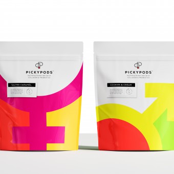
The logo is inspired by a fine tune wing nut as this brand is all about tailoring the needs of both women and men.
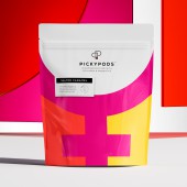
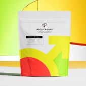
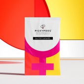
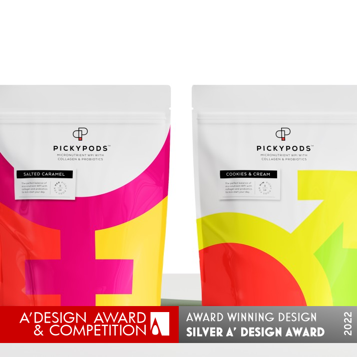
Key to the brand communication are the large sex symbols which shout out to the gender-specific formulas, and flavor labels appeal to personal preference.
UNIQUE PROPERTIES / PROJECT DESCRIPTION:
The supplement area is saturated with options, each one claiming to turn humans into ultra enhanced creatures with extraordinary existences. PickyPods is a bit different. The collagen and probiotic supplement sachets are formulated to make fine adjustments to our bodies according to age, gender and other important factors.
Color is the star player of this project—it needed to feel bold and energetic for its gym-going target.
OPERATION / FLOW / INTERACTION:
Resealable pouch
PROJECT DURATION AND LOCATION:
Project duration 4 months, Sydney 2020
FITS BEST INTO CATEGORY:
Packaging Design
|
PRODUCTION / REALIZATION TECHNOLOGY:
Stand up pouches, zip lock closures/Sachets/Labels
Pouch & Sachets Materials: MOPP / VMPET / LLDPP
Labels: Self adhesive semi gloss
SPECIFICATIONS / TECHNICAL PROPERTIES:
Pouch: 170mm x 120mm x 45mm
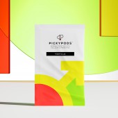
Sachet: 80mm x 130mm
Label: 210mm 42mm
Pouch/Sachets Print: 5 colour + Spot UV + Matt Varnish
Labels: 1 Colour + Matt Varnish
TAGS:
Packaging Design, Supplement Packaging Design, Pouch Design, Branding Design,
RESEARCH ABSTRACT:
The supplement category is very saturated and competitive, so the design aims to disrupt with its bold icon design focus. The gender symbols are universally understood, providing instant recognition and differentiation.
The outer packs are generic and the flavour variants are manually stickered, to assist with this low volume startup business model.
CHALLENGE:
The challenge was to find a creative way to allow 12 flavour variants be visually communicated, while keeping the print run as generic as possible. The solution was to print only 2 generic pouches that could be varied with flavour stickers. This made for a viable economic solution for the start up business.
ADDED DATE:
2021-10-12 04:06:13
TEAM MEMBERS (1) :
Angela Spindler: Creative Director/Designer
IMAGE CREDITS:
Angela Spindler, 2021.
|
| Visit the following page to learn more: https://www.wearedepot.com.au/portfolio |
|
| CLIENT/STUDIO/BRAND DETAILS |
 |
NAME:
Depot Creative
PROFILE:
Packaging design that builds brands.
We’re specialists in our field, choosing to stick with what we do best without getting stuck in our ways. We focus on food, drinks, fragrance, beauty and wellness and lifestyle because a lifetime of being immersed in these categories is where our experience comes into its own. We team up with visionary clients because they value the difference we bring to the mix. We always challenge and seek out the difference to ensure our designs remain in the mind and heart of consumers.
We’re Depot, the packaging thinkers, creators and innovators.
|
|
|
| COMMENTS |
| Giulia Esposito |
Comment #14842 on December 27, 2022, 10:07 pm |
|
I am delighted to see the innovative design of PickyPods. The thoughtful use of colors and materials is truly captivating. The packaging is both eye-catching and practical, making it the perfect choice for storing supplements. The way the lid opens and closes is also impressive, giving users an easy and convenient way to access their products. I love the overall look and feel of the design, which oozes sophistication and elegance. It is a design that surely stands out and will be remembered. Congratulations to Angela Spindler for creating such an impressive work of art!
|
| Paul Williams |
Comment #63520 on January 3, 2023, 11:43 pm |
|
PickyPods is a unique and creative packaging design that stands out from the rest! It's bold icon design focus, coupled with its gender symbols, provides an instant recognition and differentiation from other supplement options. The solution to incorporate flavour stickers over generic pouches to accommodate a low volume startup business model is genius. The attention to detail and the thought that went into creating this project is admirable. PickyPods is a true testament to the power of good design!
|
| Paul Phillips |
Comment #74448 on January 4, 2023, 4:50 am |
|
What an exciting and unique concept for a packaging project! PickyPods really stands out with its bold and energetic colors, which makes it perfect for its intended target. It’s amazing to see how the project incorporates important factors like age, gender, and more to create a product that’s designed specifically for its user. It’s a great example of how design can really make a difference in bringing a product to life, and I’m delighted that it was recognized with the A' Design Award.
|
| Elena Petrenko |
Comment #77737 on January 4, 2023, 6:29 am |
|
This packaging design ingeniously uses bold colors and icons to distinguish between gender-specific formulas and to appeal to personal preferences.
|
| Adam Harris |
Comment #84791 on January 4, 2023, 11:21 am |
|
I am absolutely in awe of this creative and bold packaging design for supplements. The design is truly unique and stands out from the crowd with its innovative use of color and symbols to convey the gender-specific formulas and flavor labels. The research behind the design is remarkable, as the team was able to find a clever way to communicate 12 flavour variants while keeping the print run as generic as possible. This is a wonderful example of good design and deserves to be celebrated. Congratulations!
|
| Chloe Turner |
Comment #91017 on January 4, 2023, 5:36 pm |
|
The design of the PickyPods packaging really stands out! The logo and use of the wing nut is so clever and creative, and the large gender symbols immediately draw attention. I love the added touch of the flavor labels to make each product unique. Every detail has been carefully thought out and the end result is an eye-catching design that perfectly reflects the brand. The overall effect is a package that looks great and is sure to grab consumers’ attention.
|
| Mark Allen |
Comment #93224 on January 4, 2023, 8:06 pm |
|
This amazing packaging design for supplements stands out with its bold, energetic colours and clear gender-specific icon design. The innovative logo and flavour labels add an extra layer of personalisation, making for an incredibly unique product. The addition of the manual stickers for the flavour variants is an economical solution for a start-up business and shows a great level of creativity and problem-solving. This is an impressive product, worthy of winning an A' Design Award.
|
| Elisabeth Clark |
Comment #94115 on January 4, 2023, 9:35 pm |
|
I am truly amazed by Angela Spindler's design for PickyPods. The bold colors and symbols used to represent the gender-specific formulas provide an instant recognition and differentiation. The logo, inspired by a fine tune wing nut, truly captures the idea of tailoring the needs of both women and men. Furthermore, the outer packs are generic and the flavour variants are manually stickered, making it easy for a low volume startup business to succeed. All in all, I believe this work is a great example of excellent design and I congratulate Angela Spindler on their success for winning the A' Design Award!
|
|
|
Did you like Angela Spindler's Packaging Design?
You will most likely enjoy other award winning packaging design as well.
Click here to view more Award Winning Packaging Design.
Did you like Pickypods Packaging For Supplements? Help us create a global awareness for good packaging design worldwide. Show your support for Angela Spindler, the creator of great packaging design by gifting them a nomination ticket so that we could promote more of their great packaging design works.
|
|
|
|
|
|
