Ching Ming Kyoto Restaurant by Takuji Kamio |
Home > Winners > #132066 |
 |
|
||||
| DESIGN DETAILS | |||||
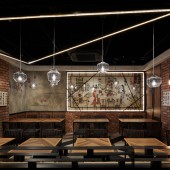
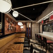
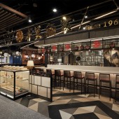
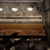
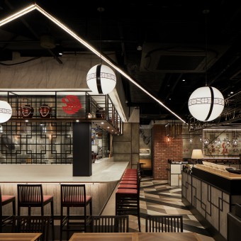
| DESIGN NAME: Ching Ming Kyoto PRIMARY FUNCTION: Restaurant INSPIRATION: Because the shop is located in a train station building and there were several regulations about ceilings, Kamio had to have some challenges to deal with lighting systems. Rather than using the normal ceiling lights, he understood and expressed the lights as art aspects. UNIQUE PROPERTIES / PROJECT DESCRIPTION: Kamio expressed the lightings as a big art by spreading them over the whole the shop area. Making the lightings in impressive line shapes, he tried to create a dramatic atmosphere. The line lights were formed in triangle shapes and connected with each other continuously to surround the shop seating areas. OPERATION / FLOW / INTERACTION: Because the team used a number of graphic expressions such as wall paintings, floor tiles, and lighting shapes, it was very important to understand how those expressions work together. They carefully fill up the drawings with the graphic patterns and shared those images with all staffs to have the common visions. For some parts, they printed out actual life size drawings and discussed about the effects. PROJECT DURATION AND LOCATION: From September 2018 to March 2019 in Kyoto, JAPAN FITS BEST INTO CATEGORY: Interior Space and Exhibition Design |
PRODUCTION / REALIZATION TECHNOLOGY: For many parts, Kamio applied artistic graphics with effective lighting systems. To emphasize the art feeling, he covered the walls with oil paintings, which are telling the some Chinese old stories, with the modern expressions, such as adding geometric patterns on the paintings. SPECIFICATIONS / TECHNICAL PROPERTIES: Floor Area : 110 square meter TAGS: Geometric lighting, Chinese restaurant, Kyoto restaurant, Authentic design, Japanese Designer RESEARCH ABSTRACT: The team made and used 3D images and models to understand the visual effects. It was very helpful to figure out how the line lights can be seen in each seating area. Also, they researched and studied several Chinese stories and art paintings in libraries for the wall graphics. CHALLENGE: Perhaps the most difficult parts in this project was to deal with lighting combination. Because the team could not place the lighting equipments directly on the ceiling, they needed to hung all the equipment. Painting the ceiling in black, the team emphasized and focused more on the floating lightings consisted on line and ball shapes. To find the appropriate balance and locations of those different shape lighting was very sensitive work and one of most important aspects to create the whole space atmosphere. ADDED DATE: 2021-10-11 23:32:20 TEAM MEMBERS (2) : Takuji Kamio and Ray Keida IMAGE CREDITS: Satoru Umetsu, nacasa and partneres PATENTS/COPYRIGHTS: Ichii Kamiodesign |
||||
| Visit the following page to learn more: http://www.kamiodesign.com | |||||
| AWARD DETAILS | |
 |
Ching Ming Kyoto Restaurant by Takuji Kamio is Winner in Interior Space and Exhibition Design Category, 2021 - 2022.· Press Members: Login or Register to request an exclusive interview with Takuji Kamio. · Click here to register inorder to view the profile and other works by Takuji Kamio. |
| SOCIAL |
| + Add to Likes / Favorites | Send to My Email | Comment | Testimonials | View Press-Release | Press Kit |

