Voila Cool Stuff Ice Cream Packaging by Kamal Rizk - Bold Branding |
Home > Winners > #131926 |
 |
|
||||
| DESIGN DETAILS | |||||
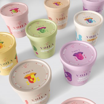
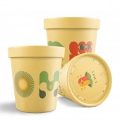
| DESIGN NAME: Voila Cool Stuff PRIMARY FUNCTION: Ice Cream Packaging INSPIRATION: The main inspiration for this design was the flavors’ shapes along with the joyful nostalgic ice cream experience, converted to soft colors and modern lines, neat patterns, fun elements & typography. The design come together to embrace the cool flavors with a hint of the nostalgic familiar feelings without having to include a direct icon or photo of the flavor. UNIQUE PROPERTIES / PROJECT DESCRIPTION: This ice cream packaging design uses the illustration language to beautifully translates the flavor in a new unique and fresh design as well as communicate the brand image and the high product’s quality standards. Each label has a differentiating color combination that is relatable to the flavor, with a bold readable title in the middle, and each label includes 4 main icons, which are the flavor pattern, the tasting tongue, the flavor typo, and the exciting optical illusion icon. OPERATION / FLOW / INTERACTION: We fashioned a unique initials typo for each flavor.. connecting it with the relatable color palette, the distinctive geometric flavor pattern, and the fun optical illusion elements that expresses the different feelings you get while enjoying ice cream; clients will be able to easily differentiate each flavor on the shelve and quickly grab their favorite bucket! The packaging is made of plastic lined paperboard which is a more environmental friendly packaging option than 100% plastic containers PROJECT DURATION AND LOCATION: The project started May 2021 in Cairo, Egypt and finished in September 2021 in Cairo Egypt FITS BEST INTO CATEGORY: Packaging Design |
PRODUCTION / REALIZATION TECHNOLOGY: Ice cream is meant to be licked, and enjoyed with all the taste buds in the tongue. Each group of flavors has a unique impact to our taste buds, thus we grouped the flavours by their taste effect into 4 main categories Spade, the loved classics like chocolate Spark, the spark of the fresh taste like fruity flavors Electric bolt, the clash of flavors that creates unforgettable experiences like yogurt berry or salted caramel Flower, represents all the nutty rich flavors that elevates ice cream taste SPECIFICATIONS / TECHNICAL PROPERTIES: Various Tapered Paper Ice Cream Containers TAGS: branding, packaging, packaging, illustration, typography, icecream, identity RESEARCH ABSTRACT: Our research was qualitative to find out what do the audience expect to see in a new ice cream packaging; and how they like and understand the new visuals; and whether it would affect their buying choice We surveyed random existing customers from the shop; It was described as; appealing, nostalgic, iconic, colorful, modern, and cool! Some results indicated difficulties in interpreting some icons; which led to design modifications so that it would be more clear, easy, and more memorable CHALLENGE: working on this cool project was very exciting for our team in Bold Branding; and to create a design language that works with 9 different flavors - so far and ready for expansion - was a challenge that we enjoyed creating and executing! ADDED DATE: 2021-10-06 20:03:36 TEAM MEMBERS (2) : Kamal Rizk - Designer and Sarah El Kasaby - Project Manager IMAGE CREDITS: Kamal Rizk - Bold Branding, 2021. |
||||
| Visit the following page to learn more: http://bit.ly/3AxsxCo | |||||
| AWARD DETAILS | |
 |
Voila Cool Stuff Ice Cream Packaging by Kamal Rizk-Bold Branding is Winner in Packaging Design Category, 2021 - 2022.· Press Members: Login or Register to request an exclusive interview with Kamal Rizk - Bold Branding. · Click here to register inorder to view the profile and other works by Kamal Rizk - Bold Branding. |
| SOCIAL |
| + Add to Likes / Favorites | Send to My Email | Comment | Testimonials | View Press-Release | Press Kit | Translations |
| COMMENTS | ||||||||||||
|
||||||||||||


