Loch Lomond Whisky Packaging by Tiger Pan |
Home > Winners > #130972 |
 |
|
||||
| DESIGN DETAILS | |||||
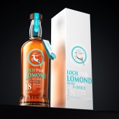
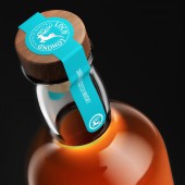
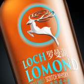
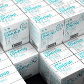
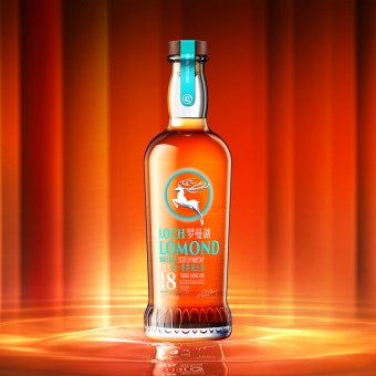
| DESIGN NAME: Loch Lomond PRIMARY FUNCTION: Whisky Packaging INSPIRATION: Inspired by the Scottish nation that advocates freedom and independence, the dashing deer has become a symbol of auspiciousness, authority, strength, elegance and mystery in Scotland. The logo design consists of a deer, a goddess, and ripples in negative space form. The graceful and imaginative profile of the goddess of Loch Lomond hides within the negative shape on the back of the deer; from the deer antlers to the ripples, it resembles the waving surface of Loch Lomond. UNIQUE PROPERTIES / PROJECT DESCRIPTION: Loch Lomond 18-Year-Old Scottish Single Malt Whisky expresses passion and energy of the youth. We picked the colour Mars green, which reflects personality, mystery, purity and trend. The logo is in both Chinese and English. With minimal decoration on the neck label, we shine the spotlight on the presentation of the packaging logo. OPERATION / FLOW / INTERACTION: How to save consumer's effort to look for an ideal product is the key challenge of this case. A distinctive symbol, a bright color, an explicit layout of info and a unitive serial system of package will help Wellmind to solve the problem, where consumers are able to recognize and pick up the products from far away. PROJECT DURATION AND LOCATION: The project lasts 2 months, designed in Shenzhen and produced in Scotland. FITS BEST INTO CATEGORY: Packaging Design |
PRODUCTION / REALIZATION TECHNOLOGY: We adopt them to achieve more effective communication with young consumers. With this new package, Jianlibao makes its way to rejuvenate the brand.And because we don't want to give up the dreamy feeling refracted by the solid material, we specifically researched a two-time injection molding method. It solves the problem of material shrinkage and surface unevenness due to thickness while retaining light refraction. SPECIFICATIONS / TECHNICAL PROPERTIES: BOTTLE :Width85.7mm x Depth85.7mm x Height283mm Outer box:Width275mm x Depth185mm x Height300mm TAGS: Whisky Bottle, Loch Lomond, loop, environmental protectio, Tiger Pan RESEARCH ABSTRACT: We picked the colour Mars green, which reflects personality, mystery, purity and trend. The logo is in both Chinese and English. With minimal decoration on the neck label, we shine the spotlight on the presentation of the packaging logo. CHALLENGE: He sun radiates from the center, concisely exuding light rays. Mysterious and full of romantic imagination, a young and passionate deer flying towards the sun with courage, embodying both static and dynamic beauty, embellished as the finishing touch in the design. ADDED DATE: 2021-09-27 12:33:58 TEAM MEMBERS (7) : Creative Director: Tiger Pan, Graphic Design: Yuxuan He, Graphic Design: Yahui Wang, Image Editing: Juanjuan Wu, Image Editing: Sijia Liu, Technical Direction: Zhangkun Xie and Technical Direction: Jinyan Zhou IMAGE CREDITS: Tiger Pan, 2021. |
||||
| Visit the following page to learn more: http://m6z.cn/5XWFBZ | |||||
| AWARD DETAILS | |
 |
Loch Lomond Whisky Packaging by Tiger Pan is Winner in Packaging Design Category, 2021 - 2022.· Press Members: Login or Register to request an exclusive interview with Tiger Pan. · Click here to register inorder to view the profile and other works by Tiger Pan. |
| SOCIAL |
| + Add to Likes / Favorites | Send to My Email | Comment | Testimonials | View Press-Release | Press Kit |

