DESIGN NAME:
Classykiss
PRIMARY FUNCTION:
Yogurt Packaging
INSPIRATION:
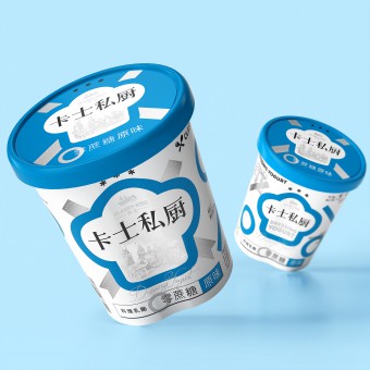
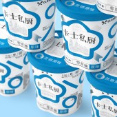
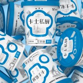
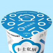
Inspired by the symbols of achievement in a diary, we emphasized on the dedicated and professional attitude of a private kitchen in the design. We used a turquoise blue closest to the colour of yogurt, positioned silver circles and minuses in a rhythmic pattern, altogether presented in a white palette. While advocating product features such as zero sugar and fat reduction, it also leaves a deep impression for consumers, making it easier to identify once on shelf.
UNIQUE PROPERTIES / PROJECT DESCRIPTION:
Perhaps related to people's pursuit of quality of life, most have shown surprisingly harsh limitations for lowering sugar intake in their diet. ClassyKiss Private Kitchen is a culinary grade yogurt specifically aimed for dressing and baking. It provides a delicious and low calorie option for consumers who are keeping in shape, but also seek to satisfy their palate. The box-shaped structure is similar to the infinity sign, a full consideration of accessibility and stability.
OPERATION / FLOW / INTERACTION:
How to save consumer's effort to look for an ideal product is the key challenge of this case. A distinctive symbol, a bright color, an explicit layout of info, and a unitive serial system of the package will help Wellmind to solve the problem, where consumers are able to recognize and pick up the products from far away.
PROJECT DURATION AND LOCATION:
The project lasts 2 month, designed in Shenzhen and produced in Shenzhen, Guangdong.
FITS BEST INTO CATEGORY:
Packaging Design
|
PRODUCTION / REALIZATION TECHNOLOGY:
The packaging is made of PLA polylactic acid material in batches, and the degradation time is as short as 2-10 months. This provided promising experimental results for packaging innovations for the same type of products.
SPECIFICATIONS / TECHNICAL PROPERTIES:
Width132mm x Depth112mm x Height113mm
TAGS:
Yogurt, ClassyKiss, Private Kitchen, loop, environmental protection, Tiger Pan
RESEARCH ABSTRACT:
We emphasized on the dedicated and professional attitude of a private kitchen in the design. We used a turquoise blue closest to the colour of yogurt, positioned silver circles and minuses in a rhythmic pattern, altogether presented in a white palette. While advocating product features such as zero sugar and fat reduction, it also leaves a deep impression for consumers, making it easier to identify once on shelf.
CHALLENGE:
Chinese consumers are more interested in low sugar but delicious food and drinks in these years, which made almost all Chinese food brand reconsider their products in a healthier way. This provided promising experimental results for packaging innovations for the same type of products.
ADDED DATE:
2021-09-27 12:22:59
TEAM MEMBERS (4) :
Creative Director: Tiger Pan, Graphic Design: Yuxuan He, Graphic Design: Yahui Wang and Image Editing: Yuling Zhu
IMAGE CREDITS:
Image #No.1: Photographer Yuling Zhu
Image #No.2: Photographer Yuling Zhu
Image #No.3: Photographer Yuling Zhu
Image #No.4: Photographer Yuling Zhu
Image #No.5: Photographer Yuling Zhu
|
