DESIGN NAME:
The Night Sky
PRIMARY FUNCTION:
Residential
INSPIRATION:
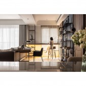
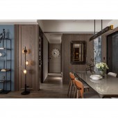
The design is based on a vintage English style, with a combination of classic furnishings, vintage mirrors, iron shelves, and wooden walls. To avoid an overwhelming impression of the space, the designer uses blue paint, blue wallpaper, crystal white tiles, and wall lamps to decorate the space. The designer also combines the spacious layout with hotel-style hospitality to create a classic but modern atmosphere.
UNIQUE PROPERTIES / PROJECT DESCRIPTION:
With contemporary imagery, the designer starts the project with a vintage British style and expects to create a hotel-like space. To avoid the stereotype of a retro style, the designer uses contemporary and textured classic furniture to decorate the project. In addition, the design techniques create a variety of layers of different materials in the same tone and bring the atmosphere of vintage England and contemporary hotel hospitality to the venue.
OPERATION / FLOW / INTERACTION:
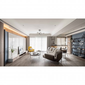
The space is decorated in a brown tone, and the designer adopts an open approach to the spacious base. In the public area, the wood-grain flooring material is used to divide the space from the entrance. The same material is then used to extend to the TV wall, with a curved pattern of work and blue palette, to create a sense of British elegance. The designer then defines the flexible area by matching the furnishings with a similar color palette.
PROJECT DURATION AND LOCATION:
The project started in January 2021 and finished in June 2021 in New Taipei City, Taiwan.
FITS BEST INTO CATEGORY:
Interior Space and Exhibition Design
|
PRODUCTION / REALIZATION TECHNOLOGY:
Art paint, crystal white tiles, ironwork, wall lamps, masonry flooring, and woodwork cabinets.
SPECIFICATIONS / TECHNICAL PROPERTIES:
The project is a 115 square meters space with 4 rooms. With an open plan, the public area retains an airy interior space, and the furnishings are well-matched with sofas, chairs, and desks to create a harmonious and tranquil space. At the same time, to eliminate the rigid and primitive distinctions in the space, the designer trimmers the squared ceilings and remove the beams with curved shapes. The final touches of brown tones, antique wood tones, and blue paint give the space an elegant look.
TAGS:
Hospitality style, Hotel style, English style, English elegance, Archetypal
RESEARCH ABSTRACT:
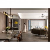
The first step into the space is the hotel-like foyer, which is highlighted by a calm and textured circular iron partition that opens an impressive prologue to the public realm.
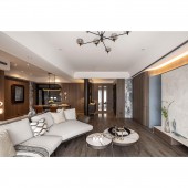
The whole project is inspired by the hotel, the designer uses recessed linear lighting, with a warm, yellow glow to match the wooden space, to bring out the vintage feel of a British hotel. The space is conceived as a hospitality space, with a spacious, non-pressurized approach to openness, with curved forms and linear grooves to reflect the visual extension and different layers.
CHALLENGE:
The space is decorated in a vintage British style. To avoid an overwhelming atmosphere, the designer uses a variety of materials in the planning of the project. The designer embellishes the wood tone space with crystal white tiles and blue paint, iron chandeliers, and circular iron inset glass screens, clearly defining the zones of the public area.
ADDED DATE:
2021-09-27 08:44:40
TEAM MEMBERS (1) :
Jau-Siang Li, Pei-Ling Liu, Steven Sun
IMAGE CREDITS:
ChiYan Design
|


