DESIGN NAME:
Gregory Donut
PRIMARY FUNCTION:
Packaging
INSPIRATION:
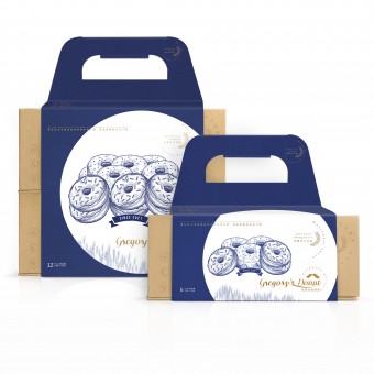
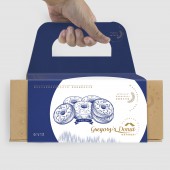
Design elements derived from Gregory captain experience. Navy blue, spary white coordinate Donuts and wheat illustration, against wheat brown, bring healthy and poetic sailor culture to the everyone. Rotational forming motion seem to be operating rudder, sail towards the distant horizon with ideal.
UNIQUE PROPERTIES / PROJECT DESCRIPTION:
Gregory donuts tenets are pays attention to all small details and bring healthy life to the modern people. Healthy low sugar, whole wheat bread base go with handmade elaboration, make everyone can enjoy healthy and exquisitely food conveniently. All the objectives about the graphic design, convenient structure design and 100% paper-base packaging materials recipe are to echo the brand idea.
OPERATION / FLOW / INTERACTION:
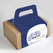
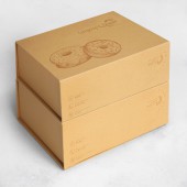
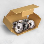
All the manufacturing processes are full automated and transported to bakery in flat format. The packer can rotate the inner part 90 degree to forming and finish the packing process rapidly and conveniently. Each box can contain 6 pieces of donuts. Depends on different buying demand, there are two different size of sleeve handles to choose from, which can meet 6 pcs or 12 pcs packaging form.
PROJECT DURATION AND LOCATION:
The project started in January 2021 and launched in March 2021 in Dongguan, Guangdong Prov, China.
FITS BEST INTO CATEGORY:
Packaging Design
|
PRODUCTION / REALIZATION TECHNOLOGY:
All visible paper are food contact grade materials.
Sleeve are made by FBB paper with high tenacity, to meet the strength requirement, coated with water base high abrasion matt varnish to achieve the function of ink protection.
Printed by food grade soy ink.
Patent 90 degree rotational structure design achieved rapidly packing and flat delivery format.
SPECIFICATIONS / TECHNICAL PROPERTIES:
Outer box size: 200mm L x 154mm W x 85mm H
Forming size (6 in 1): 201mm L x 155mm W x 86mm H(without handle)
Forming size (12 in 1): 201mm L x 155mm W x 172mm H(without handle)
Well-suited Retail take-away Packaging
TAGS:
Donuts packaging, Sustainable packaging, Convenient packaging, Take-away food, Sailor culture
RESEARCH ABSTRACT:
In 1947, a captain by the name of Hanson Gregory drove his boat in a voyage. Because of the violently shake cause by the wave and wind, he found that he can not eat his bread when driving. To overcome this situation, he had an inspiration to cut a hole in the middle of his buns and string them in the banner beside the helm. That is where donuts comes from.
This design can completely reflect the brand tenet: detail oriented, healthy life and poetic sailor culture.
CHALLENGE:
Regarding the brand communication requirements, the biggest challenge is how to bring the healthy brand idea to buyers directly with a minimalist graphic design.
Regarding the structure and material recipe, the biggest challenge are to achieve the rapid packing process with good cost control and food grade requirements.
ADDED DATE:
2021-09-27 08:40:52
TEAM MEMBERS (6) :
Innovation and Design Director: Dick To, Senior Design Manager: Jinglun Cui, Structure Manager: Qinwu Zhao, Graphic Manager: Hong Zheng, Graphic Designer: Yueying Chen and Structure Designer: Zhiping Li
IMAGE CREDITS:
Stora Enso China Packaging, 2021.
PATENTS/COPYRIGHTS:
Structure utility model patent copyright belongs to Stora Enso China Packaging
|
