DESIGN NAME:
Little Freddie
PRIMARY FUNCTION:
Puff Strips
INSPIRATION:
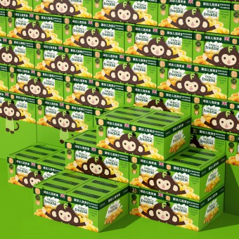
Inspired by the concept of "turning rules and restrictions into advantages", the complex sales environment of hypermarkets makes product competition more fierce, but at the same time, it can provide a wider sales venue. And more products will be presented on the shelf. When the number of products is large, it will be in a different state. At this time, the presentation of every aspect of the package is an opportunity to attract consumers' attention.
UNIQUE PROPERTIES / PROJECT DESCRIPTION:
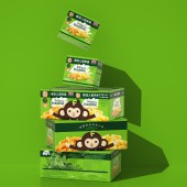
The unique attribute lies in the many limitations of the sales terminal, reduce their decision-making and thinking when buying, and provide professional consumers with more accurate product information and functional classification."; The little monkey IP is created for the eye-catching power, brand colors are used as packaging colors to enhance brand color recognition and to present information integrity.
OPERATION / FLOW / INTERACTION:
The use of the super symbol is going to be helpful and functional when Jianlibao is sold online and offline. We chose discreetly the materials, printing techniques, production crafts, all accessible, to bring the product to market as fast as possible. Therefore, the product will be taking advantage of its youthful and eye-catching look in the market for longer time.
PROJECT DURATION AND LOCATION:
The project lasts 2 month, designed in Shenzhen and produced in Shenzhen, Guangdong.
FITS BEST INTO CATEGORY:
Packaging Design
|
PRODUCTION / REALIZATION TECHNOLOGY:
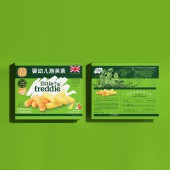
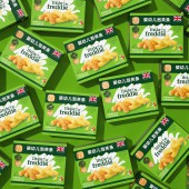
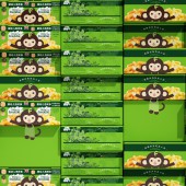
The two surfaces are presented separately, or we have also considered the state of the combined presentation so that the placement of the packaging in any state can be conveyed a better feeling.
SPECIFICATIONS / TECHNICAL PROPERTIES:
Outer packaging: Width233mm x Depth98.7mm x Height194mm
Master carton: Width495mm x Depth332mm x Height200mm
TAGS:
Puff strips, Little Freddie, Snack Packaging, Package design system, Tiger Pan
RESEARCH ABSTRACT:
Special-shaped packaging adapted to local conditions solves the problem of "too strong drug feeling and insufficient child feeling" in the original packaging. The outer contour of the IP is used as the shape of the knife line, creating a vivid image of a little monkey holding the delicious food in his arms.
CHALLENGE:
Whether it's the outer box or the secondary packaging, we have made a design for each surface, the two surfaces are presented separately, or we have also considered the state of the combined presentation so that the placement of the packaging in any state can be conveyed a better feeling.
ADDED DATE:
2021-09-27 03:21:14
TEAM MEMBERS (6) :
Creative Director: Tiger Pan, Graphic Design: Yuxuan He, Graphic Design: Han Wang, Image Editing: Yuling Zhu, Technical Direction: Zhangkun Xie and Technical Direction: Miaorong Lu
IMAGE CREDITS:
Image #No 1: Photographer Yuling Zhu
Image #No 2: Photographer Yuling Zhu
Image #No 3: Photographer Yuling Zhu
Image #No 4: Photographer Yuling Zhu
Image #No 5: Photographer Yuling Zhu
|
