DESIGN NAME:
Shuanghui Rebrand
PRIMARY FUNCTION:
Packaging
INSPIRATION:
Rebirth of a national product
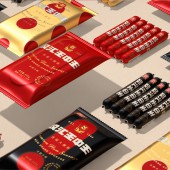
We retain the original design elements as much as possible, and use geometric graphics instead of pixelated methods to enhance the transmission efficiency of the product over longer distances. The products presenting in different angles and different combinations are summarized as different types of rounded graphics, combined with three groups of fresh and bright colors, to distinguish the feelings brought by different taste products.
UNIQUE PROPERTIES / PROJECT DESCRIPTION:
The popularity of Shuanghui Wangzhongwang ham in China is the same as the popularity of Coca-Cola in the United States. It is a super large single product with over 10 billion sales every year; it is also a national-level product that accompanies generations of youth; it is also synonymous with the category of cooked ham. It's just that the product packaging that has not been updated for more than 13 years is still stuck in the 1980s.
OPERATION / FLOW / INTERACTION:
How to save consumer's effort to look for an ideal product is the key challenge of this case. A distinctive symbol, a bright color, an explicit layout of info and a unitive serial system of package will help Wellmind to solve the problem, where consumers are able to recognize and pick up the products from far away.
PROJECT DURATION AND LOCATION:
The project lasts 2 month, designed in Shenzhen and produced in Luohe, Henan.
FITS BEST INTO CATEGORY:
Packaging Design
|
PRODUCTION / REALIZATION TECHNOLOGY:
The products presenting in different angles and different combinations are summarized as different types of rounded graphics, combined with three groups of fresh and bright colors, to distinguish the feelings brought by different taste products.
SPECIFICATIONS / TECHNICAL PROPERTIES:
Outer bag: Width130mm x Depth30mm x Height235mm
Casing: Width19mm x Depth19mm x Height147mm
TAGS:
Sausage, Food, environmental protection, rebrand, super symbol, Tiger Pan
RESEARCH ABSTRACT:
The design content is limited by the relative backwardness of packaging and printing technology at that time, so it presents an old and vulgar product state. The difficulty of our upgrade design lies in how to radiate a younger and more energetic product image on the premise of maintaining a consistent consumer memory.
CHALLENGE:
The difficulty of our upgrade design lies in how to radiate a younger and more energetic product image on the premise of maintaining a consistent consumer memory.
The new font design of the brand is curved with a 3.36 degree arc and more clearly presents elastic product properties. After testing, the attractiveness of the new design in the sales terminal is 4.6 times that of the old product.
ADDED DATE:
2021-09-27 02:42:53
TEAM MEMBERS (8) :
Creative Director: Tiger Pan, Graphic Designer: Yuxuan He, Graphic Design: Han Wang, Image Editing: Yuling Zhu, Image Editing: Chao Ma, Image Editing: Sijia Liu, Technical Direction: Zhangkun Xie and Technical Direction: Miaorong Lu
IMAGE CREDITS:
Image #No 1: Photographer Yuling Zhu
Image #No 2: Photographer Yuling Zhu
Image #No 3: Photographer Yuling Zhu
Image #No 4: Photographer Yuling Zhu
Image #No 5: Photographer Yuling Zhu
|


