DESIGN NAME:
A Touch A World Away
PRIMARY FUNCTION:
Liquid Soap
INSPIRATION:
A Touch A World Away
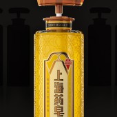
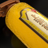
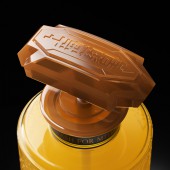
Our inspiration comes from the intriguing glass carving on the windows of Moller Villa, a fascinating fusion of Eastern and Western architectural style. A mixed decorative styled pattern runs through the entire body, including the bottle pump and bottle sticker. Through combining different materials, it reflects a hazy and ambiguous tone, exactly the result we want to achieve - the bustling and fragmented memory of Shanghai.
UNIQUE PROPERTIES / PROJECT DESCRIPTION:
As one of the few "premium" toiletries, it is deeply intertwined with most Chinese people's lives. After nearly a hundred years of changes in several generations, Shanghai Medical Soap has become part of the most delicate and pretentious lifestyle in Shanghai. Thus, we aim to discover a way to guide younger consumers to relate with the product.
OPERATION / FLOW / INTERACTION:
How to save consumer's effort to look for an ideal product is the key challenge of this case. A distinctive symbol, a bright color, an explicit layout of info and a unitive serial system of package will help Wellmind to solve the problem, where consumers are able to recognize and pick up the products from far away.
PROJECT DURATION AND LOCATION:
The project lasts 2 month, designed in Shenzhen and produced in Shanghai.
FITS BEST INTO CATEGORY:
Packaging Design
|
PRODUCTION / REALIZATION TECHNOLOGY:
A mixed decorative styled pattern runs through the entire body, including the bottle pump and bottle sticker. Through combining different materials, it reflects a hazy and ambiguous tone, exactly the result we want to achieve, the bustling and fragmented memory of Shanghai. Nonetheless, it also derives the product's anti-slip function once held in hand.
SPECIFICATIONS / TECHNICAL PROPERTIES:
Width 70mm x Depth 235mm x Height 235mm
TAGS:
Liquid Soap, Health,Beauty, Moller Villa, Shanghai memory, Tiger Pan
RESEARCH ABSTRACT:
After nearly a hundred years of changes in several generations, Shanghai Medical Soap has become part of the most delicate and pretentious lifestyle in Shanghai. Thus, we aim to discover a way to guide younger consumers to relate with the product.
CHALLENGE:
Through combining different materials, it reflects a hazy and ambiguous tone, exactly the result we want to achieve, the bustling and fragmented memory of Shanghai. Nonetheless, it also derives the product's anti-slip function once held in hand.
ADDED DATE:
2021-09-26 07:48:38
TEAM MEMBERS (7) :
Creative Director: Tiger Pan, Graphic Design: Qian Chi, Graphic Design: Meitao Ye, Image Editing: Juanjuan Wu, Image Editing: Yuling Zhu, Technical Direction: Zhangkun Xie and Project Manager: Krystal You
IMAGE CREDITS:
Image #1: Graphic Designer Tiger Pan, Shanghai Yaozao, 2021.
Image #2: Graphic Designer Tiger Pan, Shanghai Yaozao, 2021.
Image #3: Graphic Designer Tiger Pan, Shanghai Yaozao, 2021.
Image #4: Graphic Designer Tiger Pan, Shanghai Yaozao, 2021.
Image #5: Graphic Designer Tiger Pan, Shanghai Yaozao, 2021.
|


