DESIGN NAME:
Lineage de La Foliole
PRIMARY FUNCTION:
Packaging
INSPIRATION:
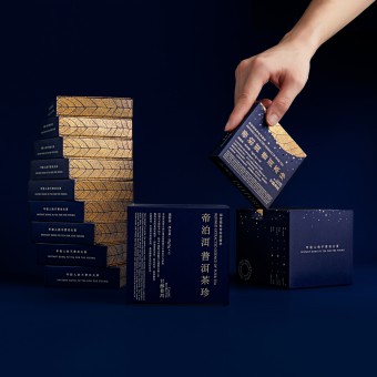
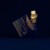
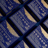
Our inspiration comes from the Chinese idiom "A Leaf as the Herald of Autumn (A Straw in the Wind)". Ancient Chinese used a leaf to perceive the world, like "seeing a World in a Grain of Sand, and a Heaven in a Wild Flower" (Blake, W. (1968), 'Auguries of Innocence'). Referencing from the process of extracting the treasure from big Pu'er tea leaves, we designed a tea leaf-shaped icon with granular texture, along with aesthetics, also explaining the product attributes.
UNIQUE PROPERTIES / PROJECT DESCRIPTION:
Normally Pu'er tea must be completed through up to nine manual steps, then the Pu'er Tea Essence allows most people to experience the exquisite taste of Pu'er in the fastest, and most effective extraction method.
OPERATION / FLOW / INTERACTION:
Praising the fine illustrations, the compact layout, the distinctive belts and the overall packaging effect. The products show up on shelves or counters in good order and eye-catching colors. Consumers are offered with more choices of holiday gifts, instead of a limited range of flowers or wines. Snacks gifts boxes can be both conveying gratitude and reflecting personal aesthetic orientation.
PROJECT DURATION AND LOCATION:
The project was done within 3 months. The design is finished in Shenzhen, produced in Shenzhen City, Guangdong Province.
FITS BEST INTO CATEGORY:
Packaging Design
|
PRODUCTION / REALIZATION TECHNOLOGY:
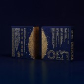
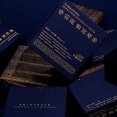
We use gold stamping to print the lines and selected elements. Different textures of stamping will enrich the overall presentation of the packages and refine with more detailed feeling. All illustrations are surrounded with golden frames, which is to enhance a sense of order and quality. The layout on the belt is stamped in copper gold, matching with the red gold logo and the pictures of products.
SPECIFICATIONS / TECHNICAL PROPERTIES:
10 push-box: Width 81.7mm x Depth 22.2mm x Height 87mm
40 sets: Width 93.7mm x Depth 85mm x Height 89mm
TAGS:
Tea Essence, Packaging Design, Beverage, Tea & Coffee, Health, Tiger Pan
RESEARCH ABSTRACT:
We used Chinese characters, the most concise and powerful Chinese cultural symbol, as the design element. The elegant and timeless Song Ti font is arranged in different forms to express a poetic beauty, conveying the product's simple, light, and luxurious tone; overall presenting a classical temperament of antique tomes.
CHALLENGE:
Referencing from the process of extracting the treasure from big Pu'er tea leaves, we designed a tea leaf-shaped icon with granular texture, along with aesthetics, also explaining the product attributes.
ADDED DATE:
2021-09-26 02:06:40
TEAM MEMBERS (7) :
Creative Director: Tiger Pan, Graphic Design: Yuxuan He, Graphic Design: Han Wang, Image Editing: Juanjuan Wu, Image Editing: Sijia Liu, Technical Direction: Zhangkun Xie and Technical Direction: Miaorong Lu
IMAGE CREDITS:
Tiger Pan, 2021.
|
