The Moo Office by Sheng-Yuan Chen |
Home > Winners > #130029 |
 |
|
||||
| DESIGN DETAILS | |||||
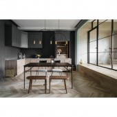
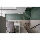
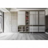
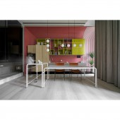
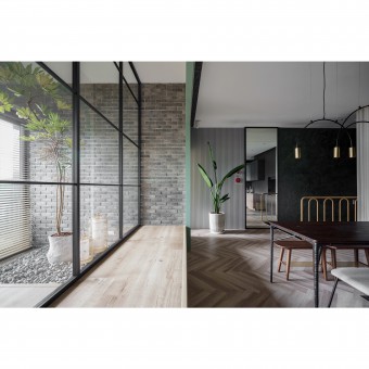
| DESIGN NAME: The Moo PRIMARY FUNCTION: Office INSPIRATION: Less is more. A word from Ludwig Mies van der Rohe, showing that the shape changes with the function, The surface is the skeleton, combining needs and space atmosphere to remove redundant branches and vines. Leaving the practicality with a sense of design makes existence necessary. UNIQUE PROPERTIES / PROJECT DESCRIPTION: The space of the three-story building divides the reception and office areas, using wall fusion, and subtracting the three-story space to reduce the depth of the space and the color theme picture. The space and color performance is the reception on the first floor-homeopathy, the office on the second floor-coordination and stability, and the rest-quiet on the third floor. Realize the sense of hierarchy in the stacked space. OPERATION / FLOW / INTERACTION: This is a store for cabinet design and sales. The main customer group is for the needs of the home. Through the creation of a home atmosphere, it is intended to trigger the desire of customers to order and purchase. Through the configuration of the space, visitors can have the imagination and expectation of the home. PROJECT DURATION AND LOCATION: 2021/03/01 completed in Taiwan FITS BEST INTO CATEGORY: Interior Space and Exhibition Design |
PRODUCTION / REALIZATION TECHNOLOGY: To promote healthy home furnishing, the main materials are particle board, Mineral water-based paint, Stone Plastic Composite flooring. Achieve a healthy space with low formaldehyde and low volatility SPECIFICATIONS / TECHNICAL PROPERTIES: 1F w500cm x d930cm x h400cm 2F w500cm x d900cm x h300cm 3F w500cm x d850cm x h310cm TAGS: interior design , office , cabinet , open space , simplicity RESEARCH ABSTRACT: Furniture and storage are what a living space needs. Since there is a necessary existence, it has the value of ink design. With a simple concept, delete and delete, and design with emphasis on practicability, from points, lines and surfaces, the structure is beautiful CHALLENGE: In the same place, on different floors, hope to bring visitors different feelings and at the same time feel harmony. Under the concept of eclecticism and minimalism, capture elements of different styles and implement simple ideas, remove branches and strengthen the performance of materials, so that the seemingly simple field has the thinking that is expected to be explored. ADDED DATE: 2021-09-10 15:03:49 TEAM MEMBERS (3) : designer:CHEN SHENG YUAN, designer:HUANG TZU TING and designer:LIU CHIA FA IMAGE CREDITS: PHOTO,DESIGN : CHEN SHENG YUAN |
||||
| Visit the following page to learn more: https://www.themoo.com.tw/ | |||||
| AWARD DETAILS | |
 |
The Moo Office by Sheng-Yuan Chen is Winner in Interior Space and Exhibition Design Category, 2021 - 2022.· Read the interview with designer Sheng-Yuan Chen for design The Moo here.· Press Members: Login or Register to request an exclusive interview with Sheng-Yuan Chen. · Click here to register inorder to view the profile and other works by Sheng-Yuan Chen. |
| SOCIAL |
| + Add to Likes / Favorites | Send to My Email | Comment | Testimonials | View Press-Release | Press Kit |
Did you like Sheng-Yuan Chen's Interior Design?
You will most likely enjoy other award winning interior design as well.
Click here to view more Award Winning Interior Design.


