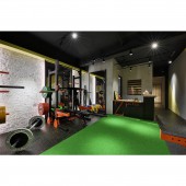
Colors and the Origin Gym by Chien-Yuan Wang |
Home > Winners > #129876 |
 |
|
||||
| DESIGN DETAILS | |||||
| DESIGN NAME: Colors and the Origin PRIMARY FUNCTION: Gym INSPIRATION: The main concept of the tone is borrowed from PANTONE 2021 Colors of the Year: the combination of Ultimate Gray and Illuminating Yellow, symbolizing solid and dependable quality from the well-thought-out feelings, and power of hope that is bright and warm. UNIQUE PROPERTIES / PROJECT DESCRIPTION: Taking Z Power, the steel-structured logo at the counter as the core value of the design, the space embodies the coexistence of power, gentleness, and aesthetics. The designer applies colors expressing happiness, hope, power and stability onto basic elements symbolizing simplicity and origin. The positive energy created at the gym offers users experiences of purity, beauty and confidence. OPERATION / FLOW / INTERACTION: Once entering the space, brick walls and the taboo-breaking "period red" form as an opening page welcoming customers on the left side. The red of "vitality and adventure" coordinates with the grass green of "life, health, and nature." The arrangement of the bare brick walls, which are commonly hidden under the surface, emphasizes the concept of simplicity, essence and the origin. PROJECT DURATION AND LOCATION: This project finished in July 2021 in New Taipei City, Taiwan. FITS BEST INTO CATEGORY: Interior Space and Exhibition Design |
PRODUCTION / REALIZATION TECHNOLOGY: The designer applies techniques of deconstruction and the idea of less is more, to balance the use of vibrant colors. The steel structured bars installed on the gate are kept as they look like originally; without use of cement and monolithic ornament, the bare brick walls are shown; the architectural concrete sets up a wall of simplicity, while the wires and beams are exposed without extra veneers covered on the ceiling. SPECIFICATIONS / TECHNICAL PROPERTIES: The project is 99 square meter. TAGS: Interior, Gym, Colorful, Pantone, Deconstruction RESEARCH ABSTRACT: While the pandemic rages all over the world, the design can express and send out messages of unshakable power, hope and happiness, through language of colors and geometry. Misfortune and disaster will come to an end one day, when a greater future is waiting for us somewhere. CHALLENGE: The designer combines simple yet effective color blocks and geometric shapes with naturally bold texture. Vivid design languages therefore contribute to users' vigorous energy. The natural elements symbolizing "the origin" are set as the starting point of the gym. While the vibrant color tone is an extension to subconsciously motivate someone's mind, the design languages are effective to promote the concept of energetic workout and well-being. ADDED DATE: 2021-09-03 09:19:43 TEAM MEMBERS (2) : Designer: Chien-Yuan Wang and Designer: Hui-Chen Fang IMAGE CREDITS: Image #1-5: Photographer Chi-Shou Wang, Colors and the Origin, 2021. |
||||
| Visit the following page to learn more: https://www.facebook.com/totemdesign/ | |||||
| AWARD DETAILS | |
 |
Colors and The Origin Gym by Chien-Yuan Wang is Winner in Interior Space and Exhibition Design Category, 2021 - 2022.· Press Members: Login or Register to request an exclusive interview with Chien-Yuan Wang. · Click here to register inorder to view the profile and other works by Chien-Yuan Wang. |
| SOCIAL |
| + Add to Likes / Favorites | Send to My Email | Comment | Testimonials | View Press-Release | Press Kit |
| COMMENTS | ||||||||||||
|
||||||||||||


