|
|
|

|
|
| DESIGN DETAILS |
DESIGN NAME:
Loacker Rebrand
PRIMARY FUNCTION:
Packaging
INSPIRATION:
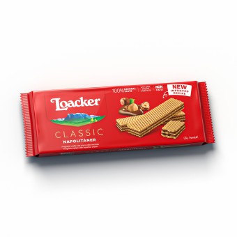
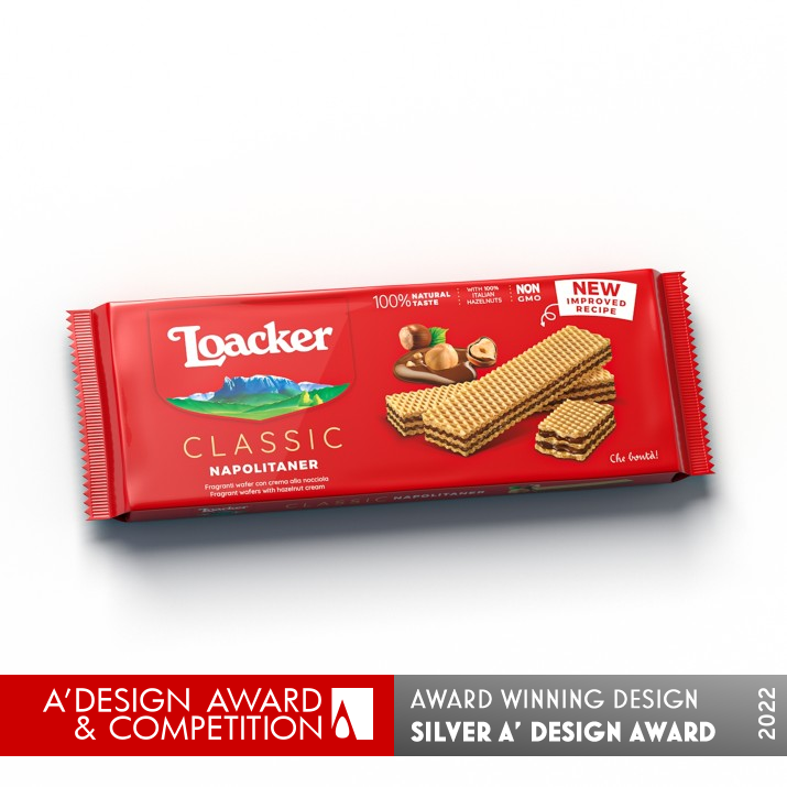
Loacker is not just a brand, is a family name. Furthermore Loacker is on the territory, actually it is the territory. From these considerations, the logo in the shape of a coat of arms was born, onto which the Mt. Sciliar has been incorporated: it is the Heritage Shield, inspired by the historical Loacker crest, which exhaustively expresses the essence of the brand, family name, roots and nature. A life philosophy that started in 1925 when Alfons Loacker settled to build his plant at 1000 meters of height.
UNIQUE PROPERTIES / PROJECT DESCRIPTION:
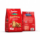
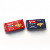
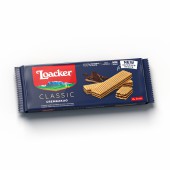
After nearly three years of work and consultancy, it finally showed a new rebranding and system pack design in favor of the historical company Loacker. Each family product has been delineated, underlining the recipe and the quality of the ingredients, additionally the architecture of the brand and the products have been redefined. On every referee we have recounted the historic claim Che bontà and on the back of the pack, the QR code redirects to the storytelling regarding the brand and the specified item.
OPERATION / FLOW / INTERACTION:
Spider has faced the challenge using our own method, by joining creative thought and strategic thinking. The agency has interviewed the Company multiple times, a chat with consumers and then suppliers. Spider has analyzed all sources: packagings shapes, products structure and their distinctive features. All maps have been gathered: conceptual ones, brand architecture maps and competitors’ charts.
PROJECT DURATION AND LOCATION:
The project started in September 2018 between Torino and Bolzano, and finished in 2021.
FITS BEST INTO CATEGORY:
Packaging Design
|
PRODUCTION / REALIZATION TECHNOLOGY:
Classic and Quadratini: rotogravure internal printing on laminated foil substrate. Classic Multipack and Premium Patisserie: Offset printing over cardboard substrate.
SPECIFICATIONS / TECHNICAL PROPERTIES:
different sizes
TAGS:
Loacker, brand, creative, branding, logo, packaging, design, rebrand, redesign, food, wafer, chocolate
RESEARCH ABSTRACT:
Spider did involve the Loacker Team to evaluate the over 200 references and for purposes of rationalization of all ranges; a definition for all categories was offered, along with one for each different positioning. The outcome of this work are various paths grounded on different strategic approaches and then declensed on reference of representation. The most efficient proposals have been tested with 5 iconic products and then verified by means of neuroscience, for instance measuring the attentionality of the consumers’ glance on the shelves, on the products and on the packaging zone. Afterwards, a POS market test followed, until the achievement of a final choice, the one consumers are used to see every day on the large scale distribution racks.
CHALLENGE:
The requirement Loacker had for the agency, was to communicate on the packs the recipe changeover, highlighting the product new pluses and also by increasing the brand perception, the aim was to find the right balance between the new brand vertical integration and the distinction among the diverse product lines. Following many meetings it has been commonly decided to go beyond the starting brief, which lead Spider to the definition of a global strategy, through rebranding till the establishment of a pack system for each product line and up to the communication of every POS.
ADDED DATE:
2021-06-29 13:53:17
TEAM MEMBERS (1) :
Spider Adv, Loacker Team
IMAGE CREDITS:
All food images were realized featuring studio PiùLuce.
|
| Visit the following page to learn more: https://www.spideradv.it/en/loacker/ |
|
| CLIENT/STUDIO/BRAND DETAILS |
 |
NAME:
Spider
PROFILE:
Spider is a creative agency based in Rivoli - Turin, which since 2009 has been developing integrated communication and branding projects, specializing in packaging design and brand image. Our name is synonymous of speed and responsiveness while our philosophy is aimed at quality. Our goal is to create professional relationships based on mutual trust. We always look for improvement in order to offer an excellent service.
|
|
|
| COMMENTS |
| Giulia Esposito |
Comment #14497 on December 27, 2022, 8:11 pm |
|
I am in awe of the incredibly well-crafted packaging design of Loacker Rebrand. The attention to detail and the thought that went into the design is remarkable. Every element of the design has been carefully considered to create a cohesive, attractive and attention-grabbing visual that stands out from the crowd. The balance between playfulness and sophistication is outstanding and the overall aesthetic is simply stunning. Congratulations to Marco Ventrice for their remarkable achievement in creating this beautiful design!
|
| Paul Williams |
Comment #62758 on January 3, 2023, 11:23 pm |
|
The Loacker Rebrand is truly an exemplary piece of packaging design. The intricate details of the branding and packaging system demonstrate a deep level of creativity, innovation, and attention to detail. From the incorporation of the historical Loacker crest, to the storytelling detailed on the back of each package, this work showcases a unique and sophisticated approach to packaging design. The research and market testing conducted ensures a successful implementation of the design that both stands out on shelves and resonates with customers. Congratulations to Marco Ventrice and team for their outstanding work on the Loacker Rebrand.
|
| Paul Phillips |
Comment #73662 on January 4, 2023, 4:27 am |
|
It's amazing to see the work that has gone into this packaging design for Loacker! The attention to detail in the delineation of each family product and the redefined architecture of the brand and the products really shows how much effort and thought has been put into this. The addition of the QR code is a great way to provide more information about the brand and the product, which is sure to be appreciated by customers. It's great to see a company take the time to explain their story and it's clear that this packaging design will be a fantastic representation of the Loacker brand.
|
| Elena Petrenko |
Comment #77065 on January 4, 2023, 6:06 am |
|
This award-winning work is a masterful representation of quality ingredients, heritage, and modern technology.
|
| Adam Harris |
Comment #83946 on January 4, 2023, 10:39 am |
|
I am simply in awe of the creativity and skill that went into creating the Loacker Rebrand! The way the brand and product lines have been redefined is truly remarkable, and the Heritage Shield logo is a fitting tribute to the brand's history and roots. The attention to detail and the research that went into the process of creating this award-winning work is simply outstanding. This work is an example of the best in packaging design, and it deserves the recognition it has received. Congratulations to the team behind this amazing achievement!
|
| Chloe Turner |
Comment #90314 on January 4, 2023, 4:49 pm |
|
I'm absolutely blown away by the stunning packaging design of this project! The idea of incorporating the Loacker family crest as the logo is absolutely genius and really brings to life the brand's heritage, roots and nature. The combination of a coat of arms with Mt. Sciliar is so visually striking and really communicates the message of the brand. The attention to detail is truly remarkable and it's clear the designer has put a lot of thought and effort into this piece. It's no wonder this project has been awarded - it's a true masterpiece!
|
| Mark Allen |
Comment #92331 on January 4, 2023, 7:04 pm |
|
This award-winning packaging design demonstrates an impressive level of creativity and research, resulting in a unified design system that celebrates the heritage and history of the brand. From the rebranding to the product lines, the design team has managed to create a visually arresting and modern look that is sure to stand out on shelves. The use of colors, textures, and patterns to communicate the brand's story is especially noteworthy. Congratulations to the design team for their success!
|
| Elisabeth Clark |
Comment #93475 on January 4, 2023, 8:31 pm |
|
It's so inspiring to see the work of Marco Ventrice being recognized with the A' Design Award. Loacker Rebrand is a perfect example of thoughtful design that embodies Loacker's identity and history. The Heritage Shield logo is a beautiful tribute to the Loacker family name, roots, and nature. It's clear that a lot of research went into creating the perfect packaging design, with Marco Ventrice and the Loacker team taking the time to evaluate more than 200 references and testing the most efficient proposals with 5 iconic products. It's amazing to see the hard work and dedication that went into creating this award-winning design, and I'm so glad to see it being recognized!
|
|
|
Did you like Marco Ventrice's Packaging Design?
You will most likely enjoy other award winning packaging design as well.
Click here to view more Award Winning Packaging Design.
Did you like Loacker Rebrand Packaging? Help us create a global awareness for good packaging design worldwide. Show your support for Marco Ventrice, the creator of great packaging design by gifting them a nomination ticket so that we could promote more of their great packaging design works.
|
|
|
|
|
|
