DESIGN NAME:
Whoatemytofu
PRIMARY FUNCTION:
Typography
INSPIRATION:
"Eating Tofu" is a Chinese proverb and a metaphor for sexual harassment. WhoAteMyTofu is inspired by this metaphor and it is aims to arouse people's curiosity and attract more attention. Graphic design as well as typography can be a tool for social change. As a woman myself, I think this project is not only a visual design support for victims of sexual harassment and a new way for them to fight against it. It is also a platform for them to speak out and feel united: You are not alone.
UNIQUE PROPERTIES / PROJECT DESCRIPTION:
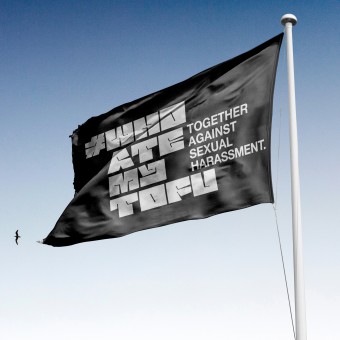
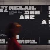
Invoking the metaphorical concept of eating tofu, this Project created an open type font design inspired by Tofu. In combination with the influence of social media hashtags and came up with the #whoatemytofu headline and web production poster concept. We aim to use the power of Typography to offer people a new possibility to fight against sexual harassment and make them feel that they are not alone.
OPERATION / FLOW / INTERACTION:
Users can enter hurtful words they have heard when they were being sexually harassed on the "Make your own poster" page and get a designed poster that they can share on their social media, tagging the hashtag#WhoAteMyTofu. Users can also download and use the tofu typeface design for free on the site, which is also inspired by the Chinese metaphor for Eating Tofu.
PROJECT DURATION AND LOCATION:
The project is my graduation project and will be completed at Bauhaus University Weimar in March 2021.
|
PRODUCTION / REALIZATION TECHNOLOGY:
In order to make the whole project highly recognizable, the font design, the poster and the web design were all designed around the element of Tofu. I designed an open-source typeface design for this project, called The Tofu Type, which was also one of the most important parts of the project. Since fonts have always played an important role in protests, more and more designers have designed open-source fonts for social movements. The idea of this typeface design is derived from the process of cutting tofu and the shape of the negative space of the letters was obtained by the process of cutting tofu.
SPECIFICATIONS / TECHNICAL PROPERTIES:
Poster, 1350px*1080px
TAGS:
against sexual harassment, Typeface design, Website concept design, Protest, Social Media
RESEARCH ABSTRACT:
I interviewed dozens of people who had experienced sexual harassment before the design began. In addition to blatant acts of sexual harassment, there are also many acts in life that are not easily recognized and are easily overlooked, making it difficult to defend the rights of victims. Unlike the usual forms of protest, this project connects people to fight against sexual harassment through an extraordinary design by collecting and exposing the hurtful words used in sexual harassment.
CHALLENGE:
The research challenges of the project are threefold. First is the font design. Like Tofu's typeface design, this form connects the material and spiritual worlds, it is like a symbol, is a sense of connectedness that is empowering. The type design process is a big challenge as it requires not only constantly improving the readability of fonts, but also making them look like tofu. Next is the interaction and visual design of the website, Although it is only a concept design, the overall web design is already very well developed, such as how users input, how to get the poster, the design of static and dynamic posters, how to download and use TOFU TYPE, etc. Lastly, I researched and investigated the social issue of sexual harassment, and I went through a long process of interviews and research before designing the project.
ADDED DATE:
2021-06-29 13:17:52
TEAM MEMBERS (1) :
IMAGE CREDITS:
Yuntong Sun, 2021.
|


