|
|
|

|
|
| DESIGN DETAILS |
DESIGN NAME:
Zaku Inc.
PRIMARY FUNCTION:
Corporate Identity
INSPIRATION:
The designer decided to use the client's company slogan itself as the logo design.
This company has the slogan "Create good!
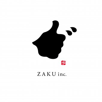
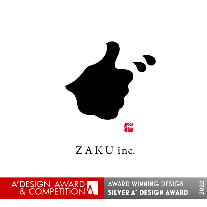
The symbol of the hand silhouette of "good!" is expressed in the typography of Japanese Kanji characters meaning "to create".
And since this kanji can be read as "zaku", it also represents the company name.
UNIQUE PROPERTIES / PROJECT DESCRIPTION:
This symbol has two meanings. It is the company name and the company slogan.
It consists of the typography of Japanese kanji characters, which read "zaku" in the company name. The combination of "signature and seal" in the mark will make Japanese people who see this design recognize it as kanji.
The kanji also contains the meaning of "to create.
The silhouette of Good!'s hand is formed using this character, which means "to create. In this way, the company's slogan of "Creating Good" is expressed in a single mark.
OPERATION / FLOW / INTERACTION:
The simple yet strong symbol design served to publicize the client's company's opening within the industry and in Japan.
People who received the DM recognized the company's slogan and name, and the meaning and background of the logo design became a topic of conversation, facilitating communication.
The "Shodo" typography and the silhouette of the "Good!" hand are catchy and memorable, and this design contributed to the recognition of the company's existence and brand image.
PROJECT DURATION AND LOCATION:
It opened in Japan in March 2021.
FITS BEST INTO CATEGORY:
Graphics, Illustration and Visual Communication Design
|
PRODUCTION / REALIZATION TECHNOLOGY:
The typography incorporates elements of Japanese "Shodo," the art of writing with a brush using ink.
The designer discovered that when the kanji meaning "to create" is written on paper, the ink blurs and spreads out to form the silhouette of the hand of Good!
Shodo (Japanese calligraphy) is a culture that has been familiar to the Japanese people for a long time. With this Japanese touch, the design gives users a sense of trust and familiarity.
SPECIFICATIONS / TECHNICAL PROPERTIES:
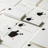
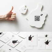
The brand design items for this project are listed below.
Logo Design: Symbol mark, Logotype, Motion Logo
Sign Design: Signage
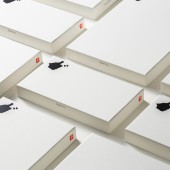
Packaging Design: Document Case x 3
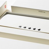
Print Design: Envelopes x 3, Promotion cards, Business cards x 3, Leaflets, Opening announcement flyer
Web Design:html5, CSS
TAGS:
Typography, Logos, Symbols, Corporate Identity, Logotypes
RESEARCH ABSTRACT:
In this design, the challenge was to give a single symbol multiple roles.
To make the company name read "Zaku".
To give it the meaning of "create".
To make it look like a silhouette of the hand of "Good!
By achieving these three goals, the client's company was able to express that it is a creative company and gain recognition in Japan and in the industry.
CHALLENGE:
The difficult part was to achieve this with as few elements and as simple a design as possible, while still having multiple meanings. The designers were also careful to make sure that the letters were recognizable.
The touch of brush strokes and the inclusion of "signature and seal" made the design more recognizable and readable.
ADDED DATE:
2021-06-28 02:46:24
TEAM MEMBERS (3) :
Creative Director:Hitoshi Kobayashi, Art Director:Nobuya Hayasaka and Copywriter:Takuma Suzuki
IMAGE CREDITS:
Nobuya Hayasaka, 2021.
|
| Visit the following page to learn more: http://zwoo.jp/ |
|
| CLIENT/STUDIO/BRAND DETAILS |
 |
NAME:
arica design inc.
PROFILE:
This firm is a design production company specializing in advertising and branding. They plan, design, and produce a wide range of products, from concept design to logos, videos, web, interior design, packaging, and more. Because they can art direct entire brands, they are able to provide consistent and unified designs.
|
|
|
| COMMENTS |
| Giulia Esposito |
Comment #14450 on December 27, 2022, 7:56 pm |
|
I am amazed by the creative vision and execution of this Corporate Identity design. The use of strong and vibrant colors, combined with the bold and unique font selections, makes it stand out from the competition. It is evident that a great deal of thought and detail was put into this design, as it is both visually appealing and highly effective. It truly is a work of art, and I am impressed with the outcome. Congratulations to Nobuya Hayasaka on their success with this award-winning design.
|
| Paul Williams |
Comment #62686 on January 3, 2023, 11:22 pm |
|
This award-winning work titled "Zaku Inc." is an exemplary example of corporate identity design. With its clever combination of typography, signature and seal, it creates a strong visual impact that is easily recognizable by Japanese people. The combination of the company name and slogan in the mark is a creative solution that expresses the company's message of "Creating Good" in a single mark. The designer's use of Japanese calligraphy is a beautiful touch that conveys trust and familiarity and further enhances the impact of the design. This work is an outstanding example of creative design and is deserving of the A' Design Award.
|
| Paul Phillips |
Comment #73585 on January 4, 2023, 4:25 am |
|
It's amazing how Nobuya Hayasaka has managed to capture the essence of the company slogan in a single mark. The combination of the typography with the signature and seal is simply beautiful and gives off a strong message of creativity. It's no surprise that this design was awarded the A' Design Award, as it's a great example of how effective visual communication can be. It's clear that a lot of thought and effort went into creating this identity, and it certainly paid off. Congratulations to Nobuya Hayasaka for their well-deserved award!
|
| Elena Petrenko |
Comment #76999 on January 4, 2023, 6:04 am |
|
This beautifully crafted corporate identity symbolizes the company's mission of creativity and innovation in a simple yet meaningful way.
|
| Adam Harris |
Comment #83830 on January 4, 2023, 10:33 am |
|
This work is truly remarkable. The combination of typography and the silhouette of the hand creates a powerful visual that conveys multiple messages. The designer has crafted a symbol that not only captures the company name and slogan, but also expresses the idea of creating something that is good. The touch of brush strokes and the inclusion of signature and seal further enhances the design. It is a great example of how a simple design can be used to create a strong and memorable corporate identity.
|
| Chloe Turner |
Comment #90218 on January 4, 2023, 4:42 pm |
|
We are simply in awe of the creativity and thoughtfulness that went into this amazing corporate identity design. The play on the company's slogan to create the logo is a stroke of genius and something that will never be forgotten when looking at the company's branding. The use of the kanji characters to form the company's name is not only visually appealing but also a perfect representation of the company's mission. Well done!
|
| Mark Allen |
Comment #92203 on January 4, 2023, 6:55 pm |
|
Congratulations to the winner of the A' Design Award in Graphics, Illustration and Visual Communication Design Category! This work creatively combines Japanese kanji characters with an iconic hand silhouette to express the company name and slogan in a single mark. The incorporation of traditional calligraphy techniques is a perfect touch that gives users a sense of trust and familiarity. A remarkable achievement indeed!
|
| Elisabeth Clark |
Comment #93387 on January 4, 2023, 8:22 pm |
|
Congratulations Nobuya Hayasaka for winning the A' Design Award with your incredible work Zaku Inc.! Your design is a beautiful example of excellent graphic design, with the perfect combination of typography, signature and seal, and a meaningful kanji character to represent the company slogan “Create Good!". Your research and attention to detail is evident in the way you managed to make a single symbol represent multiple roles and your creativity in expressing that the company is a creative one is admirable. Your award-winning work is an inspiration to all aspiring designers.
|
|
|
Did you like Nobuya Hayasaka's Graphic Design?
You will most likely enjoy other award winning graphic design as well.
Click here to view more Award Winning Graphic Design.
Did you like Zaku Inc. Corporate Identity? Help us create a global awareness for good graphic design worldwide. Show your support for Nobuya Hayasaka, the creator of great graphic design by gifting them a nomination ticket so that we could promote more of their great graphic design works.
|
|
|
|
|
|
