DESIGN NAME:
ListSmart
PRIMARY FUNCTION:
Application
INSPIRATION:
Several studies have shown that people who use shopping lists have spent less and bought fewer items than those who did not. Based on an initial survey conducted with 58 residents in major metropolitan areas, it was obersved that many only occasionally use shopping lists and they usually use their default notes application. Some reasons for the participants’ answers stem from the ease of a notes application and that many find it too complicated to plan out their purchases.
UNIQUE PROPERTIES / PROJECT DESCRIPTION:
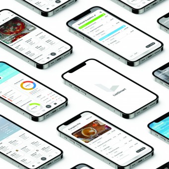
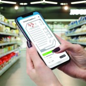
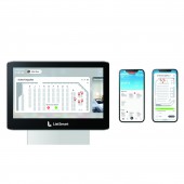
ListSmart is an intelligent shopping list application and service design. Features include smart item suggestions, budgeting, and a collaborative platform. These aim to create a new perspective on shopping for the user and to encourage better spending habits. ListSmart can also be applied as a service to grocery stores to help enhance the shopping experience. With the implementation of ListSmart kiosks users can access their lists at certain stores and can obtain store maps through NFC.
OPERATION / FLOW / INTERACTION:
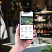
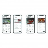
ListSmart is simple and easy to use for anyone. The home screen has a summary of the user’s budget shown through weather conditions with their lists shown below. The next screen is the List Marketplace where users can upload and download lists uploaded by others. All lists are shown in a grid layout and have thumbnail previews. Screens like the budget screen and list creation screen are shown through sheets on the screen. Having information shown on cards allows for a dynamic user experience.
PROJECT DURATION AND LOCATION:
The project started in October 2020 in West Lafayette, Indiana at Purdue University and was initially completed in March 2021.
FITS BEST INTO CATEGORY:
Interface, Interaction and User Experience Design
|
PRODUCTION / REALIZATION TECHNOLOGY:
The design software used was Adobe XD, Adobe Illustrator, and other prototype developing tools.
SPECIFICATIONS / TECHNICAL PROPERTIES:
This project was designed for iOS and web screen sizes. The mobile version was designed with iOS in mind while the kiosk interface was designed to fit most web formats (1920 x 1080px).
TAGS:
Interaction design, Smart shopping lists, Budgeting applications, Service design, Intelligent recommendations, UX design, UI design
RESEARCH ABSTRACT:
The ListSmart team conducted various surveys and user tests to refine the design topic. In the early stages of the project a survey was released with over 50 participants in the target demographic regarding their spending and shopping habits. The team figured out key features through prototyping and user testing. These methods combined with prior research on the target demographic of millennials living in metropolitan areas enabled the team to fully realize the project.
CHALLENGE:
The first challenge was understanding how to optimize people’s spending and shopping habits through a mobile application solution. Another major challenge was creating a list application which is unique and has a define unique value proposition. The ListSmart team made sure to not overcomplicate the graphical user interface which is a common issue with list applications and to make a clear user flow.
ADDED DATE:
2021-06-25 14:32:19
TEAM MEMBERS (2) :
Jung Joo Sohn and Abhay Sunil
IMAGE CREDITS:
Jung Joo Sohn and Abhay Sunil, 2021.
|


