DESIGN NAME:
Blendlab
PRIMARY FUNCTION:
Branding
INSPIRATION:
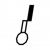
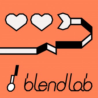
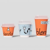
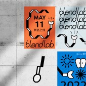
A spoon immersed in a liquid will cause a distorted visual phenomenon due to refraction. This is the starting point to design a fun interesting logo. The handle of this spoon can rotate, fold, unfold to various extensible shapes. A distorted & extensible & steerable spoon made me remember a game called "Greedy Snake" which was very popular years ago. The spoon "walk" in the space, blend coffee, milk, tea, or fruits, like the greedy snake, always stay hungry for creativity.
UNIQUE PROPERTIES / PROJECT DESCRIPTION:
The client came to me to create a unique & modern visual system for her upcoming drink shop in Wuhan, China. "Spoon" was selected as logo starting point. A spoon is a symbol to represent the idea of her shop: blend to create more inspirational flavors. Playing with the "Spoon in water cause refraction" idea and the inspiration taken from the game"Greedy Snake", different unique shapes of this extensible specific spoon are created. All sparkles eventually came to an exciting, strong, variable but unified visual system.
OPERATION / FLOW / INTERACTION:
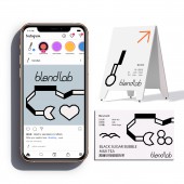
This project started with a conversation with the client. Through the conversation, I find out the ethos of the brand and what the client wants to convey. Through further conversation and research, I gathered more information about the tone and language of Blendlab. Base on that, I started working on the keep concept and then developed the art direction for the brand based on the core concept. Then, I apply this visual language to all applications around this brand.
PROJECT DURATION AND LOCATION:
2 mouths
Executed in NYC and Wuhan, China
FITS BEST INTO CATEGORY:
Graphics, Illustration and Visual Communication Design
|
PRODUCTION / REALIZATION TECHNOLOGY:
Adobe suite, Branding, Visual System, Art Direction, Graphic Design, Logo Design, Printing, Package Design, Social Media Content Design
SPECIFICATIONS / TECHNICAL PROPERTIES:
Menu: 420mm x 594mm
Cards: 88.9mm x 50.8mm
Posters: 297mm x 420 mm
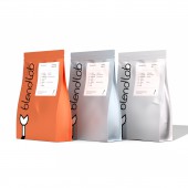
1 Cup Bag: 100mm x 230mm x110mm
2 Cups Bag: 200mm x 230mm x 110mm
Cups for winter: 90mm x 58mm x 112mm
Cups for Summer: 98mm x 60mm x 107mm
Tissue: 230mm x 230mm
Tape: 12.5mm x 5000mm
TAGS:
Branding, Graphic Design, Visual Identity,Coffee, Milk Tea, Modern, Unique
RESEARCH ABSTRACT:
The research included 3 parts:
1. Communications with the client.
2. Concept research. This part focused on what idea can make a spoon which I chose to represent the "blending to create inspirational flavors" idea more interesting and unique.
3. Visual research. According to the core concept driving from the result of step2, I need to find out how to use visual language to convey the concept in a mordern and unique way.
CHALLENGE:
1. How to make the spoon interesting.
2. How to develop an exciting, strong, variable but unified visual system around that concept.
3. Color choose
ADDED DATE:
2021-06-16 23:12:15
TEAM MEMBERS (1) :
Moree Wu
IMAGE CREDITS:
Creative Direction:Moree Wu
Art Direction:Moree Wu
|
