Oliveira Almeida Brand Identity by Ricardo Filipe Lopes da Silva |
Home > Winners > #126100 |
 |
|
||||
| DESIGN DETAILS | |||||
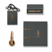
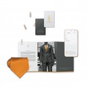
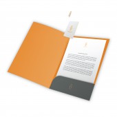
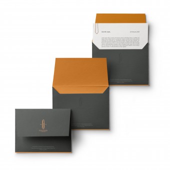
| DESIGN NAME: Oliveira Almeida PRIMARY FUNCTION: Brand Identity INSPIRATION: The idea emerged from observing the daily responsibilities of a lawyer, constituting a fundamental principle of advising clients wisely. Interpret laws and apply them to specific cases, gather evidence for a case, search public records and other legal records. These processes require a lot of organizational discipline to collect the paperwork orderly or to change specific documents whenever necessary. So, nothing is more suitable than a paper clip. UNIQUE PROPERTIES / PROJECT DESCRIPTION: As a defender of righteous causes, the firm has the mission to put invaluable legal evidence together in order to bring effective solutions to customers. To better depict the brand values, the logo combines a necktie that represents nobility and a paper clip that not only fulfills its primary function of holding paper together but symbolizes order. These elements are present in lawyers 'daily lives, and turning them into a day-to-day device will help the brand stick to clients' memory. OPERATION / FLOW / INTERACTION: In general, law firms tend to use symbols extensively such as the scales of justice, swords, or anything that involves classic architectural elements. And to stand out from the competition surged the idea of creating something that goes beyond these symbols and visual identity. Thus, the fabrication of the tie-shaped clip came to life in order to invite the client to have a practical experience with the brand. On the of it, the color palette applied to all media and office tools reinforces the appearance of the brand in such a way that the target audience will recognize it in the absence of the logo. PROJECT DURATION AND LOCATION: February 2020 to April 2020 in Curitiba, Brazil FITS BEST INTO CATEGORY: Graphics, Illustration and Visual Communication Design |
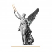
PRODUCTION / REALIZATION TECHNOLOGY: The project was designed in Affinity Designer and Affinity Photo to keep the vector and photo montage quality. The logo design was built based on the Golden Ratio rule by using a Phi grid order to appear in the most harmonious way. On the production step, the designs were delivered in RGB, CMYK, and Pantone colours. The Tie-shaped clips were crafted in solid brass. SPECIFICATIONS / TECHNICAL PROPERTIES: Tie-shaped clip in solid Brass - 8 mm (width) x 30 mm (height) For the stationery, Visual Identity guidelines were provided to ensure that all the materials will be done correctly. All the graphics and illustrations were vectorized and saved as print-ready files. TAGS: law, order, tradition, lawyers, law firm, brand, paper clip, RESEARCH ABSTRACT: Besides the research on how the public perceives law firms. The colour scheme was carried out based on the etymology of the firm's name. Oliveira simply means Oliveira which contains a wide range of green colours, from dark to light tones. On the coats of arms, it is the symbol of peace and victory. About Almeida, this comes from the Arabic terms the meaning al, table meaning maida. In the geographical sense, it means something like a plateau or flat soil which contains earthy colours. CHALLENGE: One of the challenges was to bring unexpected symbols from the law and order environment to life for a physical experience, without losing the classic feel. To depict the name of the firm and tie it together with the activities of the lawyers, I dug into the etymology of Oliveira de Almeida to extract the right colour palette. This gave the final touch to the brand identity. ADDED DATE: 2021-05-08 09:13:15 TEAM MEMBERS (1) : IMAGE CREDITS: Image 5: Photographer Luke Michael, Angel holding round wreath statue, 2017. |
||||
| Visit the following page to learn more: http://bit.ly/3xWfnid | |||||
| AWARD DETAILS | |
 |
Oliveira Almeida Brand Identity by Ricardo Filipe Lopes Da Silva is Winner in Graphics, Illustration and Visual Communication Design Category, 2021 - 2022.· Press Members: Login or Register to request an exclusive interview with Ricardo Filipe Lopes da Silva. · Click here to register inorder to view the profile and other works by Ricardo Filipe Lopes da Silva. |
| SOCIAL |
| + Add to Likes / Favorites | Send to My Email | Comment | Testimonials | View Press-Release | Press Kit |

