DESIGN NAME: Sun Rose
PRIMARY FUNCTION: Wine Label
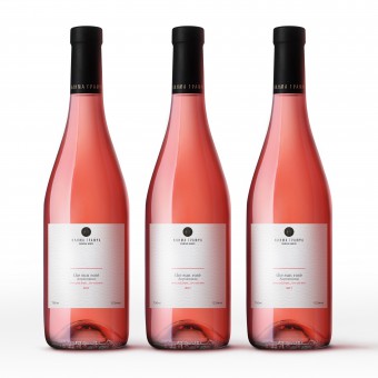
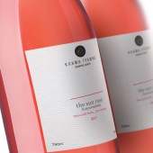
INSPIRATION: Wanting to make the above facts clear A.S. we drew inspiration from the horizon that defines the earth and placed all the information that describe the wine, properly, where the elements that define the wine are present. The earth.
High above all these elements, the logo stands in the same place one would expect the sun, making it stand out while being in line with the playful choice of words, the sun rose.
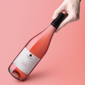
UNIQUE PROPERTIES / PROJECT DESCRIPTION: Τhe Sunset . As you have never seen it before, just before it sets, gives us this unique colour, one of it’s best versions … the sun rose….
The minimal approach is as minimal as it can get to express the essence of a unique wine.
OPERATION / FLOW / INTERACTION: The packaging managed to present to the oenophile the essential elements of what defines the wine that they experience.
PROJECT DURATION AND LOCATION: The project began and finished in 2018 in Athens (Greece).
FITS BEST INTO CATEGORY: Packaging Design
|
PRODUCTION / REALIZATION TECHNOLOGY: Glass & Paper. Environmentally friendly.
SPECIFICATIONS / TECHNICAL PROPERTIES: -
TAGS: The sun rose, wine, Packaging, Design, Storytelling, Klima Grampsa
RESEARCH ABSTRACT: A thorough market research was conducted in order to frame the market, the competitors and the potential buyers. In addition, mood boards were formed to better express the values and ethos of the company, and to agree on a direction and a design concept (visual representation always helps us get on the same page).
CHALLENGE: -
ADDED DATE: 2021-04-07 12:57:12
TEAM MEMBERS (4) : Creative Director: Antonia Skaraki, Designers: Evri Makridis, Copywriter: Sotiria Theodorou and
IMAGE CREDITS: Antonia Skaraki, 2021.
|