Travelspot Brand Identity Design by Barrage d.o.o |
Home > Winners > #124868 |
 |
|
||||
| DESIGN DETAILS | |||||
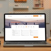
| DESIGN NAME: Travelspot PRIMARY FUNCTION: Brand Identity Design INSPIRATION: It was a quote by Ibn Battuta that made us think about business trips. The quote says how traveling leaves us speechless and turns us then into storytellers. We asked ourselves whether business travelers have interesting travel memories as well? After hearing numerous interesting anecdotes the answer was Yes. The main source of inspiration are their stories. Stories that are unexpected, fascinating and exciting. And they are told not by business travelers, but by true storytellers. UNIQUE PROPERTIES / PROJECT DESCRIPTION: Most companies in this industry tend to have an ordinary corporate visual language. They usually lack in playfulness that travelings are full of. Business trips are not that boring after all. This design was made to reflect Travelspot's mission to make business trips more relaxed. It echoes their relaxed, enjoyable and bright side. The new identity design makes Travelspot stand out in this industry. It's different because of its atypically joyful look and feel made to disrupt the exhausting effect these trips can have. OPERATION / FLOW / INTERACTION: The new brand identity is a combination of various elements that form a composition for a relaxed visual language. This allows Travelspot to bring joy and pleasure into the life of stressed business travelers. The focus is put on the traveler. At Travelspot users are not called users. They are called travelers because each of them is viewed as an individual storyteller. Travelspot also gives them a medium to share their unique stories after an exciting business trip. By doing so it is establishing a deeper connection between the individual and the brand. PROJECT DURATION AND LOCATION: The project started initially in 2018 in Osijek, Croatia, with the development of an online booking application. In 2019 a brand identity redesign was conducted. FITS BEST INTO CATEGORY: Graphics, Illustration and Visual Communication Design |
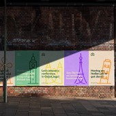
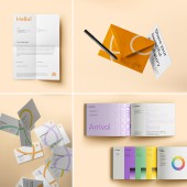
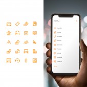
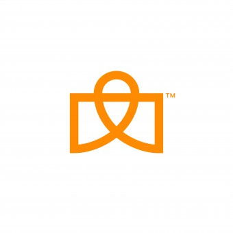
PRODUCTION / REALIZATION TECHNOLOGY: The online booking system is developed with technologies such as VueJS for frontend, NodeJS for backend, PostgreSQL for the database. The UI design was initially created in Sketch and was later transferred to Figma. Apps used for the visual identity design include Adobe Illustrator for vector graphics, also Photoshop and Lightroom for photography. InDesign was used for print design and AfterEffects for motion graphics. SPECIFICATIONS / TECHNICAL PROPERTIES: A thorough visual language has been created for this project. The logomark is a combination of a travel bag, map pin and a loop which is also a roller coaster. The Travelspot loop is being replicated throughout the identity design. A special pictogram system was designed for this purpose to supplement the visual language. For example, it is being used to create pictograms of landmarks from famous destinations. Additional systems for icons and illustrations have been developed as well. Regarding the color system, a triadic combination complemented with one additional tone has been used for the palette. The main color is Amber (#FF8B00) supplemented with Smog (#333333) as the secondary one. Tertiary tones include Lavender (#CFA0F8), Mint (#91D4A3) and Tuscany (#FFD733). We don't prefer to call them simply Orange, Green or Purple. Every single of them is unique just like every travel story. Hence, each deserves its own unique name. TAGS: branding, brand identity, visual identity, logo, communication, brand strategy, RESEARCH ABSTRACT: After the initial brainstorming, an interview session was conducted with business travelers. The goal was to get an insight into their travel experiences. The result that unfolded was a clear view of their stories. We listened to exciting travel stories they had. A story that was inspiring involved a roller coaster ride. When we think about it, business trips are like a roller coaster ride. Some people love them while some people hate them. Some want to repeat them right away. Others want them to end as soon as possible. In the end, business trips create interesting stories for travelers they keep and enjoy retelling for a very long time. A question that arose after this stage was how to translate their experiences into a visual language. The design of the logomark is based on a loop. This idea came only after an extensive brainstorming phase. The loop allowed later an endless play when creating for example pictograms and icons. To add one additional value to the design system, a set of illustrations was created. Various illustration styles have been developed and tested with the UI design. It was important to achieve a unified visual language. CHALLENGE: For the majority of business people organizing a business trip is time consuming and stressful. Unfortunately the troubles don't stop there. Even when everything is booked and the trip is ongoing things can go wrong forcing business travelers to reorganize repeatedly. On top of everything managing expenses is an additional hassle. Travelspot recognizes the needs of business travelers. It wants to show them that despite all inconveniences business trips can indeed be a pleasant experience. ADDED DATE: 2021-04-06 11:03:57 TEAM MEMBERS (1) : The team at Barrage. IMAGE CREDITS: Mockups by Pixeden and Urban Street Mockups. PATENTS/COPYRIGHTS: Trademark (2021) Ivan Rimac, Feđa Ivanšić |
||||
| Visit the following page to learn more: https://www.travelspot.com/ | |||||
| AWARD DETAILS | |
 |
Travelspot Brand Identity Design by Barrage D.o.o is Winner in Graphics, Illustration and Visual Communication Design Category, 2020 - 2021.· Press Members: Login or Register to request an exclusive interview with Barrage d.o.o. · Click here to register inorder to view the profile and other works by Barrage d.o.o. |
| SOCIAL |
| + Add to Likes / Favorites | Send to My Email | Comment | Testimonials | View Press-Release | Press Kit |

