Sienna Monroe Identity and Packaging by Ricci Williams |
Home > Winners > #124404 |
 |
|
||||
| DESIGN DETAILS | |||||
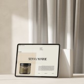
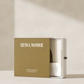
| DESIGN NAME: Sienna Monroe PRIMARY FUNCTION: Identity and Packaging INSPIRATION: The client was clear that they wanted an instantly recognizable logotype that was sophisticated and modern but playful and steer away from the script and handwritten lettering often associated with conscious brands. The photography reflects a specific desire to include natural elements without appearing messy. The shots feature daylight, unfinished walls and draped curtains, while the plinths provide height and depth to the images. UNIQUE PROPERTIES / PROJECT DESCRIPTION: Sienna Monroe is a conscious cosmetics brand that creates plant-based, cruelty-free beauty products. We created a unique identity, packaging and stationery to fit the brand's ethos and eco-needs. We wanted to ensure that to create protective packaging without being wasteful, reflect the brand's desire to tackle environmental issues at all stages of their product's life cycle and encourage their customers to think twice about their products' re-usability. OPERATION / FLOW / INTERACTION: The idea is to encourage the user to re-use the packaging by making it feel less like something they would throw away. Glass bottles can be used more than once, extending the packaging's lifespan far beyond that of the product. Glass is also non-toxic and does not contain Bisphenol-A and other potentially hazardous chemicals found in plastics. Plastic is made from oil and gas. These are non-renewable resources that will run out eventually. PROJECT DURATION AND LOCATION: The project was completed in Los Angeles during the summer of 2020. FITS BEST INTO CATEGORY: Graphics, Illustration and Visual Communication Design |
PRODUCTION / REALIZATION TECHNOLOGY: To minimize waste, the beauty gift box doubles as a shipping box for online orders. The box is manufactured from recycled un-coated, compostable cardboard stock printed with vegetable inks. The potion bottles are all made from infinitely recyclable glass and can be recycled repeatedly and still retain their original material integrity. At the same time, the self-adhesive sticker is made from Post-Consumer Waste paper stock. SPECIFICATIONS / TECHNICAL PROPERTIES: Bottles and Packaging are various sizes Presentation Box is 300 x 300 mm Cylinder Box is 90 x 90 x 230 mm Soap is 120 x 30 x 60 mm TAGS: eco-packaging, brand identity, art direction, beauty, fashion, logotype RESEARCH ABSTRACT: The client had put together a series of mood boards to give us some ideas regarding the visual direction. This included some initial type treatment concepts for the logo, packaging and layout designs and mood imagery for the photographic renders. We went through three rounds of presentation, from initial concepts through to final idea presentation working closely with the client at each stage. CHALLENGE: The most challenging part of this project was to meet the client's brief. They were keen to have something that customers would know without using cliched vegan design cues. The key to achieving this was in adding the natural print pattern to the design. It gave the design some depth in colour, but it also provided a softness juxtaposed nicely with the somewhat harsh typography. ADDED DATE: 2021-03-30 23:54:27 TEAM MEMBERS (1) : IMAGE CREDITS: Ricci Williams, 2020. |
||||
| Visit the following page to learn more: http://www.ricciwilliams.com | |||||
| AWARD DETAILS | |
 |
Sienna Monroe Identity and Packaging by Ricci Williams is Winner in Packaging Design Category, 2020 - 2021.· Press Members: Login or Register to request an exclusive interview with Ricci Williams. · Click here to register inorder to view the profile and other works by Ricci Williams. |
| SOCIAL |
| + Add to Likes / Favorites | Send to My Email | Comment | Testimonials | View Press-Release | Press Kit |


