Mazurro Coffee Packaging by 19 Poludnik Agencja Reklamowa |
Home > Winners > #124176 |
 |
|
||||
| DESIGN DETAILS | |||||
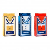
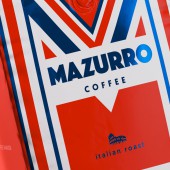
| DESIGN NAME: Mazurro PRIMARY FUNCTION: Coffee Packaging INSPIRATION: The main theme of visual communication is an expressive graphic pattern based on the letter M. The symbol is inspired by the works of Josef Hoffman, the founder of the so-called Viennese workshops, whose design, based on simple forms, set the direction for later modernism. UNIQUE PROPERTIES / PROJECT DESCRIPTION: The packaging design is based on a very distinctive pattern hinged on the letter M. It determines the strong, dominant look of Mazurro coffee bags. The minimalistic, geometric form and strong contrasts combined with an Italian vibe make the bags stand out on store shelves. Mazurro identity is a playful game of artistic conventions, an almost derealized or detached movie-like experience. OPERATION / FLOW / INTERACTION: The graphic design is stripped of unnecessary additional decorations, because the spectacular packaging itself` is the decoration. The pattern is inspired by the works of Josef Hoffman, the founder of the famous Vienna Workshop. The inspiration is not accidental. Vienna Workshop was ahead of its time, laying the foundations for modernism in design. We have limited the product portfolio to 3 flavors. Each of them differs in color and printing method - selecting a white underprint in order to obtain a metallic effect in designated places. PROJECT DURATION AND LOCATION: The project started in April 2020 in Katowice and finished in August 2020, and the online shop was launched in November 2020. FITS BEST INTO CATEGORY: Packaging Design |
PRODUCTION / REALIZATION TECHNOLOGY: The packaging design was printed on flexographic printer. SPECIFICATIONS / TECHNICAL PROPERTIES: 500g packaging: Width 130mm x Depth 75mm x Height 270mm TAGS: coffee packaging, packaging design, packaging, coffee, brand identity, communication RESEARCH ABSTRACT: It was a multi-stage process. Basically, the process was divided into two stages: internal-with the client, at his company (team analyzing the market and various data, the basic assumptions of the project and priorities) and external, when the guidelines are sent to our studio and with the close cooperation of both units, they end with the creation of a new packaging design. CHALLENGE: The challenge was to create an Italian coffee with a brand name that doesn't exist in Italian. ADDED DATE: 2021-03-29 10:53:02 TEAM MEMBERS (2) : Paweł Mikołajec and Dawid Koruszowic IMAGE CREDITS: Main Image, Image #1: Creator 19 Południk, 2020, Image #2, #3, #4: Photographer Marcin Kempski, 2020 Video Credits: Creator 19 Południk, Mazurro - Brand Identity - Packaging Communication - Case Study, 2020 PATENTS/COPYRIGHTS: Not applicable. |
||||
| Visit the following page to learn more: https://mazurro.com/ | |||||
| AWARD DETAILS | |
 |
Mazurro Coffee Packaging by 19 Poludnik Agencja Reklamowa is Winner in Packaging Design Category, 2020 - 2021.· Read the interview with designer 19 Poludnik Agencja Reklamowa for design Mazurro here.· Press Members: Login or Register to request an exclusive interview with 19 Poludnik Agencja Reklamowa. · Click here to register inorder to view the profile and other works by 19 Poludnik Agencja Reklamowa. |
| SOCIAL |
| + Add to Likes / Favorites | Send to My Email | Comment | Testimonials | View Press-Release | Press Kit |
Did you like 19 Poludnik Agencja Reklamowa's Packaging Design?
You will most likely enjoy other award winning packaging design as well.
Click here to view more Award Winning Packaging Design.


