The Carmel Interior Design by Matthew Li |
Home > Winners > #123802 |
 |
|
||||
| DESIGN DETAILS | |||||
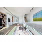
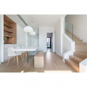
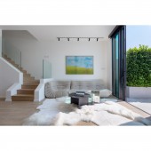
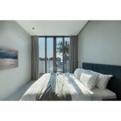
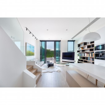
| DESIGN NAME: The Carmel PRIMARY FUNCTION: Interior Design INSPIRATION: The designer took foreign resort houses as a reference before the whole process. Large windows let an extensive amount of sunlight go into the house and shape a relaxing atmosphere. UNIQUE PROPERTIES / PROJECT DESCRIPTION: The house owners request a home design where allows them to loosen up after the busy work schedule. The designer then chose a white and wood palette for the design and create a resort-like space with a relaxing atmosphere. The designer makes good use of the high ceiling of the house, added two huge ceiling lights to the living room as a highlight without making the room stuffy. OPERATION / FLOW / INTERACTION: This is a design dedicated to a family of three in Hong Kong. Due to the busy workload and schoolwork the family member always have, they requested a place where they can truly unwind themselves and spend with family. To fulfil their needs, an open plan living and dining area allow them to interact with one another in a roomy space without any barrier in between. Moreover, the designer converted two rooms into a game room and a study room, where the family can have private time while working or having fun without disturbing one another. PROJECT DURATION AND LOCATION: The project was finished in December 2020 in Hong Kong. FITS BEST INTO CATEGORY: Interior Space and Exhibition Design |
PRODUCTION / REALIZATION TECHNOLOGY: In order to create a relaxing and holiday-like mood for the family, an all-white palette has been selected. On top of it, light oak wooden furniture has been set to the living and dining area to maintain a consistent aura. SPECIFICATIONS / TECHNICAL PROPERTIES: It is a 1,722 square-feet house. TAGS: Interior Design, residence, house, simplicity, minimumism, comfortable RESEARCH ABSTRACT: The house owners request a home design where allows them to loosen up after the busy work schedule. Our designer then chose a white and wood palette for the design and create a resort-like space with a relaxing atmosphere. The designer makes good use of the high ceiling of the house, added two huge ceiling lights to the living room as a highlight without making the room stuffy. Besides, family time is one of the most valuable elements of this household. The designer has managed to assign most of the furniture by the wall. Thus, by doing so, the room looks extremely spacious and allow the family to spend quality time together. CHALLENGE: Although the all-white palette presents a relaxing and makes the space roomier and brighter, it may also create a boring and dull design. Therefore, our designer has put two ceiling lights in the dining area, used light oak furniture and hung a colourful painting above the sofa as highlights. Moreover, the house owners claimed that they have a huge storage area need for the house. Knowing that excessive cabinets will make space a lot messier, the designer has then made good use of the high ceiling level, set various full height cabinets with doors, to keep the house neat and clean. ADDED DATE: 2021-03-24 09:15:22 TEAM MEMBERS (1) : Matthew Li IMAGE CREDITS: Grande Development Limited PATENTS/COPYRIGHTS: Grande Development Limited |
||||
| Visit the following page to learn more: http://bit.ly/3u1JBxj | |||||
| AWARD DETAILS | |
 |
The Carmel Interior Design by Matthew Li is Winner in Interior Space and Exhibition Design Category, 2020 - 2021.· Press Members: Login or Register to request an exclusive interview with Matthew Li. · Click here to register inorder to view the profile and other works by Matthew Li. |
| SOCIAL |
| + Add to Likes / Favorites | Send to My Email | Comment | Testimonials | View Press-Release | Press Kit |

