|
|
|

|
|
| DESIGN DETAILS |
DESIGN NAME:
Zhenshiming
PRIMARY FUNCTION:
Eye Mask
INSPIRATION:
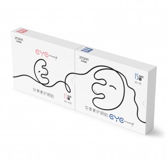
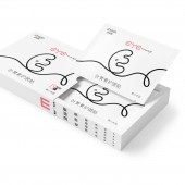
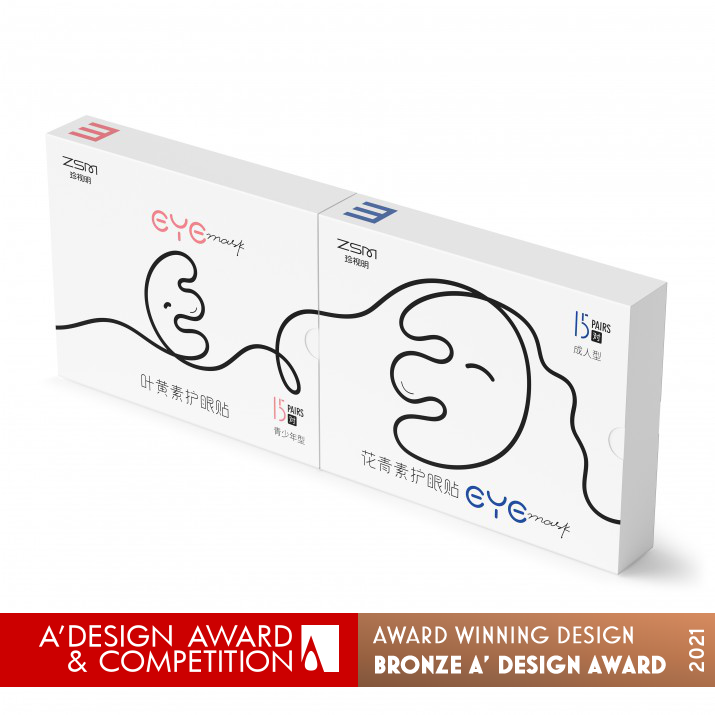
The function of the product is to protect eyes and relieve eye fatigue.Young women are the main consumers. According to the consumer groups, the series packaging is divided into youth type and adult type, which are expressed in simple and interesting visual form. The capital letter E is a common form of Chinese visual acuity chart, and consumers are familiar with it. Using “E” as the main visual elements not only echoes the product characteristics but also increases the interest.
UNIQUE PROPERTIES / PROJECT DESCRIPTION:
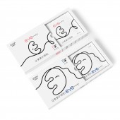
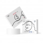
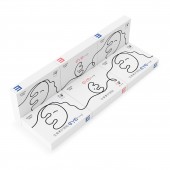
This is a product of eye mask. The capital letter E is a common form of Chinese visual acuity chart, and consumers are familiar with it. The letter E is transformed into a smiling face, and the shape of English word “eye” is outlined with a stroke. The two products form a complete visual work and exist separately. A complete visual chart is showed on the side after the box is opened, which is familiar to consumers and could be used to test vision simply. This makes the products more interesting.The word “eye” in the “eye mask” is designed into a owl’s face. The red "eye" represents youth and vitality, and the blue ones represents maturity and steadiness.
OPERATION / FLOW / INTERACTION:
This is a product of eye mask. The function of the product is to protect eyes and relieve eye fatigue, and bring a healthy and comfortable experience. A complete visual chart is showed on the side after the box is opened, which is familiar to consumers and could be used to test vision simply. This makes the products more interesting.
PROJECT DURATION AND LOCATION:
The project started in October 2020 in Beijing and finished in November 2020 in Beijing
FITS BEST INTO CATEGORY:
Packaging Design
|
PRODUCTION / REALIZATION TECHNOLOGY:
The material is white cardboard
SPECIFICATIONS / TECHNICAL PROPERTIES:
135mm×105mm×28mm
TAGS:
Interesting,Concise,
RESEARCH ABSTRACT:
-
CHALLENGE:
The connection of lines in two product pictures in the printing process. And harmonious cooperation between product box cover and inner box.
ADDED DATE:
2021-03-22 10:23:23
TEAM MEMBERS (1) :
IMAGE CREDITS:
Bo Yang, 2020.
|
|
| CLIENT/STUDIO/BRAND DETAILS |
 |
NAME:
Beijing Bofly Design Co.,Ltd
PROFILE:
Beijing Bofly Design Co.,LTD is established in 2007. It’s an excellent brand marketing and design company in China. The business includes enterprise image building, brand design promotion, package design and other professional design fields. It provides excellent design service and brand management for many enterprises based on the design concept of "creating brand competitiveness”. It has served in beer, beverage, food, tea, It, industry, real estate, household, medicine and other fields. Companies they served includes CCTV, Carlsberg Beer, Nestle, Tsingtao beer, Huiyuan Group, Sanyuan food, etc.
|
|
|
|
Did you like Bo Yang's Packaging Design?
You will most likely enjoy other award winning packaging design as well.
Click here to view more Award Winning Packaging Design.
Did you like Zhenshiming Eye Mask? Help us create a global awareness for good packaging design worldwide. Show your support for Bo Yang, the creator of great packaging design by gifting them a nomination ticket so that we could promote more of their great packaging design works.
|
|

|
|
|
|
