DESIGN NAME:
Dodoshine
PRIMARY FUNCTION:
Brand Design
INSPIRATION:
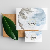
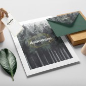
Designers are inspired by two aspects. First of all, "shine" expresses the sunshine lifestyle and UV technology. The "do" added to the front is not only an action instruction, but it also means "more" in Chinese pronunciation. Second, designers found that famous fashion brands used exaggerated serifs on logos, which impressed people. Therefore, the designers carefully used some of these elements to make the brand image slightly fashionable.
UNIQUE PROPERTIES / PROJECT DESCRIPTION:
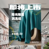
Dodoshine is designed for an appliance brand that uses UV sterilization technology. The name draws on the Chinese habit of using sunlight to kill bacteria, that not only promotes a healthy lifestyle, but also cleverly combines with the uv technology. On the basis of the bold sans-serif font, the logo adds serif elements that fashion brands like. This design allows the brand to show a sunny and slightly fashionable image, helping the brand to accurately position itself in market segments.
OPERATION / FLOW / INTERACTION:
People can see and read it. And then they can understand the meaning of the logo.
PROJECT DURATION AND LOCATION:
The project started in April 2019 in Beijing and finished in March 2020 in Beijing.
FITS BEST INTO CATEGORY:
Graphics, Illustration and Visual Communication Design
|
PRODUCTION / REALIZATION TECHNOLOGY:
It can be print on the product or marketing material.
SPECIFICATIONS / TECHNICAL PROPERTIES:
It can be print on the minimal size at 34mm x 10mm.
TAGS:
logo, shine, logotype, typeface, font
RESEARCH ABSTRACT:
The designers have discovered the Chinese believe that regular exposure to sunlight can effectively kill bacteria on objects. They often expose their quilts and clothes to the sun. Therefore, the key to the success of the UV appliance brand is to smoothly migrate people's habits to the brand's products. The design of the brand should give people the feeling of sunshine and sterilization.
CHALLENGE:
The positioning of the brand is to bring a slightly fashionable on the basis of meeting the needs of the public. It is neither as fashionable as a fashion brand, nor as an ordinary technology brand. Therefore, accurately expressing the brand positioning through the logo is a major challenge for this design.
ADDED DATE:
2021-03-22 05:52:20
TEAM MEMBERS (9) :
Creative Director: Xu Chen, Art Director: TianShu Liu, Consultant: Rong Zhang, Technical Head: ShuLong Li, Design Technology: Qian Hao, Designer: FangBo Wu, Designer: BeiBei Liu, Engineer: MingJie Zhang and Project Manager: Yan Liu
IMAGE CREDITS:
Xu Chen and Rong Zhang, 2020.
|


