La Boutique Jzn Commercial Space by Millton Yu |
Home > Winners > #123736 |
 |
|
||||
| DESIGN DETAILS | |||||
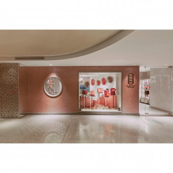
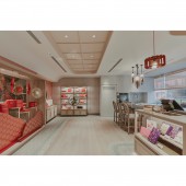
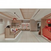
| DESIGN NAME: La Boutique Jzn PRIMARY FUNCTION: Commercial Space INSPIRATION: While walking into the matte-gold-pink visual delight, embraced by the chic and elegant atmosphere from inside and outside the Chinese gridded window, one can surely feel a sense of joy and happiness in the space. UNIQUE PROPERTIES / PROJECT DESCRIPTION: As a leading brand in the upscale HAN PASTRY market, JZN and its design team for the new store are committed to creating a unique EXPERIENCE STORE to incorporate the warmth of the century-old pastry business with modern spatial aesthetics. It sets a high standard to be in line with the image of five-star hotels and international fashion brands to welcome tourists from all over the world. OPERATION / FLOW / INTERACTION: When a pastry store is presented with spatial aesthetics and exquisiteness to showcase boutique pastries in high-quality packaging, this design project provides an answer to the boutique marketing strategy for traditional classic pastry business. It sets up a high standard in the quest for brand innovation. PROJECT DURATION AND LOCATION: The project finished in November 2019 in Taipei, Taiwan. FITS BEST INTO CATEGORY: Interior Space and Exhibition Design |
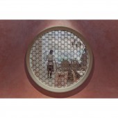
PRODUCTION / REALIZATION TECHNOLOGY: To differ from traditional pastry store, the designers carefully choose their use of color tone, interior construction material, and take on space planning. Rouge color, widely used in traditional wedding ceremonies, as well as the festival, is replaced by matte-gold-pink color to form a highly impressive soft color tone in the space. The choice of design helps the brand get rid of the old-fashioned image and become vibrant and young instead. Through marketing strategy, it expands the customer base and invigorates this century pastry brand simultaneously. SPECIFICATIONS / TECHNICAL PROPERTIES: The project is 68 square meter. TAGS: Commercial, Shop, Interior Design, Space, Food RESEARCH ABSTRACT: The shapes of square and circle are the brand symbol. While the word for square in Chinese means scope and standard, the word for circle in Chinese means Harmony. The symbols of square and circle are used as the visual image in the Chinese boutique pastry store, including the pattern of Chinese gridded window, the shape of the ceiling, the arc angle desktop, woven rattan door of the cabinet, woven rattan chair back as well as the pattern of metal wire embedded on the floor. CHALLENGE: The design team takes the design challenge to re-present a sense of elegance inherited from the traditional pastry brand while balancing between tradition and contemporary. The focus on the representation of traditional elements keeps the Brand Legacy. While shaping the space through the eyes of contemporary, and incorporating chic elements to re-present tradition, the boutique pastry store brings out the recurrence of the sense of joy and happiness of old time. ADDED DATE: 2021-03-22 03:25:38 TEAM MEMBERS (1) : Designer: Millton Yu IMAGE CREDITS: Image #1-5: Photographer Alvic Han, La Boutique Jzn, 2019. |
||||
| Visit the following page to learn more: http://www.m-interior-design-m.com | |||||
| AWARD DETAILS | |
 |
La Boutique Jzn Commercial Space by Millton Yu is Winner in Interior Space and Exhibition Design Category, 2020 - 2021.· Press Members: Login or Register to request an exclusive interview with Millton Yu. · Click here to register inorder to view the profile and other works by Millton Yu. |
| SOCIAL |
| + Add to Likes / Favorites | Send to My Email | Comment | Testimonials | View Press-Release | Press Kit |


