|
|
|

|
|
| DESIGN DETAILS |
DESIGN NAME:
Taste of Tohoku
PRIMARY FUNCTION:
Packaging
INSPIRATION:
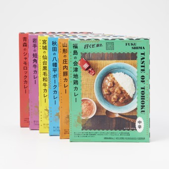
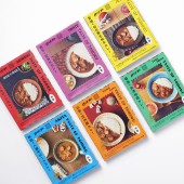
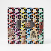
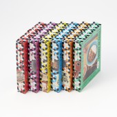
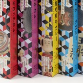
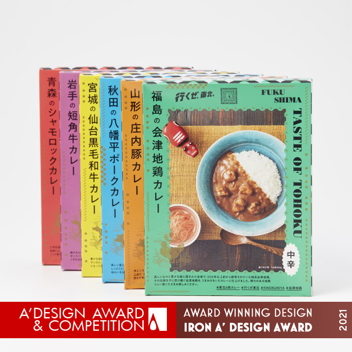
This is the package design of the retort curry. The concept is to connect consumers and communities so that they know who made them. In order to achieve both "nostalgic";; and "urban sophistication", the design is clean and simple while using retro fonts. When the sides of the package are lined up, it becomes a single picture, and there is a lot of fun.
UNIQUE PROPERTIES / PROJECT DESCRIPTION:
It is a package design of the original retort curry series using meat from the Tohoku region of Japan.The curry made from carefully selected ingredients is expressed through the package design. Arranged local crafts from Tohoku, it is luxuriously decorated with gold and handwritten emblems.
OPERATION / FLOW / INTERACTION:
-
PROJECT DURATION AND LOCATION:
-
FITS BEST INTO CATEGORY:
Packaging Design
|
PRODUCTION / REALIZATION TECHNOLOGY:
-
SPECIFICATIONS / TECHNICAL PROPERTIES:
Width 142mm × Depth 30mm × Height 182mm
TAGS:
-
RESEARCH ABSTRACT:
-
CHALLENGE:
-
ADDED DATE:
2021-03-18 01:52:30
TEAM MEMBERS (1) :
IMAGE CREDITS:
Dodo Design Co., Ltd., 2020.
|
|
| CLIENT/STUDIO/BRAND DETAILS |
 |
NAME:
-
PROFILE:
-
|
|
|
|
Did you like Dodo Design Co., Ltd's Packaging Design?
You will most likely enjoy other award winning packaging design as well.
Click here to view more Award Winning Packaging Design.
Did you like Taste of Tohoku Packaging? Help us create a global awareness for good packaging design worldwide. Show your support for Dodo Design Co., Ltd, the creator of great packaging design by gifting them a nomination ticket so that we could promote more of their great packaging design works.
|
|
|
|
|
|


