DESIGN NAME:
Huaihua · Hexing Peninsula City Center
PRIMARY FUNCTION:
Marketing Center
INSPIRATION:
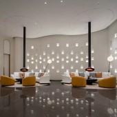
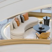
The project aims at designing a fashion and splendid marketing center integrating modern art with the theme of "dynamic water rhythm". Its interior space combines the building shape and the surrounding environment, blurs the boundary between the interior and the exterior to achieve spatial integration. The building is based on a pure white tone, colliding and intermingling with gold, simple and elegance. The rhythm of light and shadows gives the space fluctuating emotions.
UNIQUE PROPERTIES / PROJECT DESCRIPTION:
The building winds upwards in an interlocking spiral form blending with the surrounding waterscape, just like an art center suspended on water. The designer adopts technique including echoing the architecture, using water as the pulse and integrating the scenario, and combines modern art with the spatial concept of "tangible without boundary" to create a highly modern marketing center with rich artistic levels and expressions.
OPERATION / FLOW / INTERACTION:
The interior design works in concert with the exterior shape. The designer visualizes the light and agile posture of flowing water and ripples, breaking the rule of too symmetrical and square conventional design. The smooth curved shape and circular ripples embody the variable rhythm. The visitor follows the dedicated scenes, explores step by step and eventually becomes the protagonist of this space.
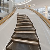
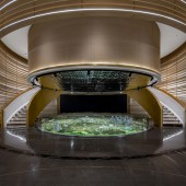
In the limited elliptical building, the designer makes full use of the vertical space and adopts open design to make the elliptical space boundless. Without deliberate division, each functional area is both independent and intertwined. Meanwhile, the use of lines captures the vivid moments of flowing water with a smooth visual sense. The reasonable combination of lines, light and shadows and artwork gives the visitor the enjoyment of traveling upward, as if from the underwater world to the starry sea.
PROJECT DURATION AND LOCATION:
The project started its interior space planning in Shenzhen in June 2020, completed the interior design plan in September, and finished construction and opened to the public in Huaihua, Hunan Province on November 15. The project was affirmed by the owner and also received wide praise from the industry.
FITS BEST INTO CATEGORY:
Interior Space and Exhibition Design
|
PRODUCTION / REALIZATION TECHNOLOGY:
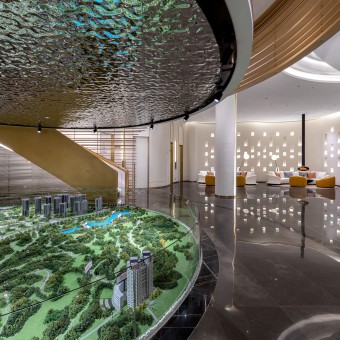
With water as a medium, the building uses materials reflecting the characteristics of water and echoing modern aesthetics to highlight this modern art space. Its floor is made of highly reflective stone combined with metal, as if people are walking on calm water. Its curved stone background at the entrance integrates with the artistic twisted mirror, like breeze rippling across the sea. Under the mirrored corrugated metal ceiling, the huge whale sculpture becomes the visual focus of the transitional space, making visitors feel like in a fantasy underwater world.
SPECIFICATIONS / TECHNICAL PROPERTIES:
32.94m*25.34m*23.76m
TAGS:
-
RESEARCH ABSTRACT:
The marketing center plays a significant role in the sales process. This project utilizes the characteristic building shape, abandons the traditional arrangement method, and creates a featured, flexible and open space to the public under the premise of ensuring the spatial functions and convenience. At the same time, the designer turns disadvantages into advantages, maximizes the limited space, and combines interior soft furnishings with artwork, so that the single-function marketing center becomes a multi-functional space of 1+N, opening an innovative revolution of marketing centers.
CHALLENGE:
The special building shape of the market center brings great restrictions to the space function design and layout. The main building of the project is formed by three ovals stacked in a staggered manner, and the size of each floor varies. The designer sets sightseeing staircases and staircases at the location of the overlay, which not only solves the problem of lighting, making use of natural lighting and visually produces a permeable effect, but also solves the problem of space traffic and strengthens the emotional link and communication between the interior space and the outside nature.
The abandonment of the traditional arrangement of the marketing center and the increase of the functional diversity is the second major challenge. The designer uses the 6-meter height of the floor and combines the sandbox with the audio-visual room to make the space open and tense. In addition, the outdoor terrace generated by the dislocation of the building and the indoor water bar together realize the functional combination, creating a new ecological relationship with the integration of human beings, nature and space.
ADDED DATE:
2021-03-13 16:39:15
TEAM MEMBERS (7) :
Lisha Wu, Hong Yang, Yupeng cheng, Mei Peng, Yan Tang, Qian Li and Min Zhang
IMAGE CREDITS:
Double Teams Design Consultant Co.,Ltd., 2020.
|
