Bel Gusto Packaging by Olga Takhtarova |
Home > Winners > #123472 |
 |
|
||||
| DESIGN DETAILS | |||||
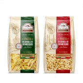
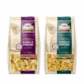
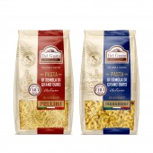
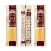
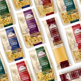
| DESIGN NAME: Bel Gusto PRIMARY FUNCTION: Packaging INSPIRATION: The idea for the rebranding of Bel Gusto was to create a package design in a postal parcel sent from Italy. Most people associate postage with distant countries, travel, and souvenirs. The design included the following elements typical for postal items: postage stamps, stamps, hand-drawn illustrations, and kraft paper imitation. UNIQUE PROPERTIES / PROJECT DESCRIPTION: Bel Gusto is a Ukrainian brand that produces fresh pasta from the best types of grains of durum wheat grown in southern Italy. The pasta trade line includes: Penne, Conchiglie, Fellini, Fusilli, Makaroni. Spaghetti, Cavatappi. To strengthen the position of Bel Gusto in the market, the designer carried out a rebranding, which brought the TM in line with the current market requirements. OPERATION / FLOW / INTERACTION: To introduce the product, create a particular brand image, and give it integrity - the designer used a plot illustration - hand-drawn historical places in Italy. Traditional packaging hides the box's contents, but many buyers want to know what the product looks like on the inside. Therefore, the designer used a viewing window in the package, so the buyer can see the box's contents and be confident in its quality. PROJECT DURATION AND LOCATION: Ukraine, Kyiv, the project began in September 2019 and ended in May 2020 FITS BEST INTO CATEGORY: Packaging Design |
PRODUCTION / REALIZATION TECHNOLOGY: PET film. Сolor CMYK, PANTONE. Selective varnish SPECIFICATIONS / TECHNICAL PROPERTIES: Penne, Conchiglie, Fusilli, Spaghetti, Cavatappi - packing size 380 x 250 mm Fellini, Makaroni - packing size 380 x 230 mm TAGS: packaging, pasta, Italy, food RESEARCH ABSTRACT: The primary color was an imitation of natural material, namely kraft paper - this is the primary trend of recent times. It emphasized the similarity of the packaging with a postal parcel and created the image of a natural, healthy product. Color stripes carefully selected by the designer are responsible for the differentiation of the products in the line. To maintain consistency, we used colors of the same saturation and brightness. We capitalized the typeface part of the design to add value to the brand, and the calligraphic font added premium value. CHALLENGE: Thus, thanks to the rebranding, the product, which has long been familiar to the consumer, acquired a new, attractive, exciting package and stood out favorably among other brands. ADDED DATE: 2021-03-13 09:31:08 TEAM MEMBERS (1) : IMAGE CREDITS: Olga Takhtarova, 2020. |
||||
| Visit the following page to learn more: https://sotdesign.com/ | |||||
| AWARD DETAILS | |
 |
Bel Gusto Packaging by Olga Takhtarova is Winner in Packaging Design Category, 2020 - 2021.· Press Members: Login or Register to request an exclusive interview with Olga Takhtarova. · Click here to register inorder to view the profile and other works by Olga Takhtarova. |
| SOCIAL |
| + Add to Likes / Favorites | Send to My Email | Comment | Testimonials | View Press-Release | Press Kit |

