FHG Brand Corporate Identity by PBB Creative Agency |
Home > Winners > #123067 |
 |
|
||||
| DESIGN DETAILS | |||||
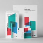
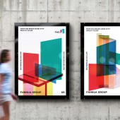
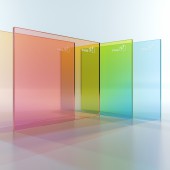
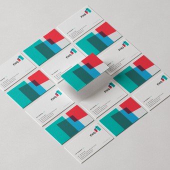
| DESIGN NAME: FHG Brand PRIMARY FUNCTION: Corporate Identity INSPIRATION: The key inspiration of this project comes from glass, the core product line of FH Group. The transparency, shapes and layers of glass pieces that form the logo reflect their product properties and functionality, but also depict the company’s vision to generate new technology and design new products. The logo offers a three dimension experience to the viewers, which hints a message that FH Group is evolving from a traditional industrial manufacturer into an innovative global company. UNIQUE PROPERTIES / PROJECT DESCRIPTION: FH Group is the third largest all-base solid-state electrochromic glass manufacturer in the world. PBB designed a corporate identity using a combination of four layers of glass to form an FH. FH comes from the company’s original name Fan Hua, which in Chinese means Glorious City. While being a modern flat logo, it incorporates the initials FH into the design in a creative, simple and clear fashion. The colors were also carefully chosen to visually present company’s vision and culture. OPERATION / FLOW / INTERACTION: The first step of the workflow involve interaction between client and agency to fully understand the client's product line and the company vision. The second step was an industry analysis and creative research to bring technical concepts and creative direction together. The third step was the development of a creative direction, logo design and visual identity. The fourth step was to bring the visual identity to life through a collaboration with interior designers. The final steps was the implementation of the visual identity in the client's production facility and communication materials. PROJECT DURATION AND LOCATION: This collaboration lasted from April 2020 to March 2021. PBB received the initial client brief in April 2020 from the client which in located in Nantong, China. The Research and Analysis phase then started and was completed by July 2020. The Logo and Visual Identity were designed from August to October, 2020. The Application and Interior Design phase lasted between November, 2020 and March 2021. The locations production locations were Beijing and Nantong, in China. FITS BEST INTO CATEGORY: Graphics, Illustration and Visual Communication Design |
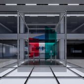
PRODUCTION / REALIZATION TECHNOLOGY: The corporate identity design was adapted into an interior design artwork, combining PBB's modern graphic design methodologies and FH Group cutting-edge solid-state electrochromic glass production technologies. This unique combinaison of creativity and technology delivers a glass architecture experience that transports visitors into a vibrant and colorful environment. This realization really shows the potential of a dedicated collaboration between client and agency. SPECIFICATIONS / TECHNICAL PROPERTIES: The logo and visual identity were adapted into real-life interior design installation of over 3m x 3m x 3m, presenting the visitors with a 3D representing of the logo. In addition to displaying the logo and brand strength, it is also a display of FH products. TAGS: Rebrand, Logo, Innovation, Graphic Design, Visual Identity, Interior Design RESEARCH ABSTRACT: Through qualitative research and interviews with the client's sales people and top industry global clients, PBB discovered that the perception of global towards FHG and the Chinese glass manufacture industry was that it could deliver quality and low price product, but they were not recognized as global innovators. Therefore, the corporate identity used that insight to push a bold, innovative and modern design that would transcend the imagination of global clients and support B2B sales. CHALLENGE: PBB wanted to represent FHG' products variety and communicate it into a simple artwork viewers could easily recognize and understand. As glass manufacturing is a traditional industry, the key challenge was to convince client to adopt a bolder design direction. Through several discussions, the client recognized the potential of the project and was brave enough to transcend the industry conservative culture. ADDED DATE: 2021-03-06 16:19:20 TEAM MEMBERS (16) : Agency: PBB Creative, Client: FHG, , Team Members:, Julien Ranjard, Creative Direction, Joseph Chieng, Interior and Architecture Design, Katherine Yao, Law and IP Rights, Wei Wang, Art Direction, Liang Chen, Graphic Design, Shizi Han, Graphic Design, Lola Mechineau, Graphic Design, Zhanhong Huang, Graphic Design, Xizi Lisu, Account Management, Karen Gao, Project Management, Fan Tu, Research and IMAGE CREDITS: All images and designs were created by PBB Creative PATENTS/COPYRIGHTS: Trademark in registration process |
||||
| Visit the following page to learn more: http://www.pbbcreative.com | |||||
| AWARD DETAILS | |
 |
Fhg Brand Corporate Identity by Pbb Creative Agency is Winner in Graphics, Illustration and Visual Communication Design Category, 2020 - 2021.· Read the interview with designer PBB Creative Agency for design FHG Brand here.· Press Members: Login or Register to request an exclusive interview with PBB Creative Agency. · Click here to register inorder to view the profile and other works by PBB Creative Agency. |
| SOCIAL |
| + Add to Likes / Favorites | Send to My Email | Comment | Testimonials | View Press-Release | Press Kit |
Did you like Pbb Creative Agency's Graphic Design?
You will most likely enjoy other award winning graphic design as well.
Click here to view more Award Winning Graphic Design.


