Cheetos Redesign Packaging by Dennis Furniss |
Home > Winners > #122989 |
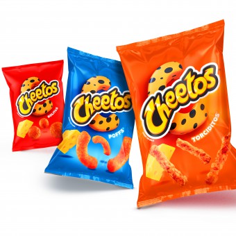 |
|
||||
| DESIGN DETAILS | |||||
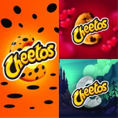
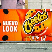
| DESIGN NAME: Cheetos Redesign PRIMARY FUNCTION: Packaging INSPIRATION: With a heavy heart PepsiCo gave Chester a retirement party. And then got to work on The Big Letter C. A new graphic asset, THE BIG Letter C, is an uplifting symbol that represents the essence of the brand. This C is a typographic element that is designed to be authentic and unique. It is mischievous. It is fun. It works across the flavor portfolio. And it can be localized. Additionally, for consumers, this design had outstanding results. UNIQUE PROPERTIES / PROJECT DESCRIPTION: In 2020, new regulations were put in place by the Mexican government which meant PepsiCo had to walk away from its most recognizable brand asset. Chester. So, they thanked him for all the hard work and got to work themselves redesigning the brand from the ground up. By far their biggest challenge was that Chester is literally baked into the DNA of the brand. PepsiCo faced some tough questions. Like, how do you keep the voice of the brand alive without its spokesperson? OPERATION / FLOW / INTERACTION: From a marketing perspective, PepsiCo's brief was to revolutionize the Cheetos equity and packaging while maintaining the brand essence that they have nurtured over more than a decade. Basically, they had to replace something everyone has known and loved for the last 30 years with something new that they will love just as much. PROJECT DURATION AND LOCATION: Mexico, initiated, completed, and launched in 2020 FITS BEST INTO CATEGORY: Packaging Design |
PRODUCTION / REALIZATION TECHNOLOGY: Flexo printing over foil substrate. SPECIFICATIONS / TECHNICAL PROPERTIES: width 132.5 mm x height 250 mm TAGS: Chester, Cheetos, brand, creative, Chips, PepsiCo, Branding, Packaging RESEARCH ABSTRACT: Cheetos has a 40 year history in Mexico. 30 of those years Chester was Cheetos mascot. He has been one of the most loved and well known characters in all of Mexican culture. Mischievous. Fun. Undoubtedly, Chester was the most iconic asset for the Cheetos brand. But the new regulations ban characters from packaging and marketing. To test and learn about the designs potential the PepsiCo research team evaluated the design through extensive accelerated Quantitative and Qualitative consumer studies, before they finally arrived at the amazing Pack Design that went to market. CHALLENGE: By far their biggest challenge was that Chester is literally baked into the DNA of the brand. PepsiCo faced some tough questions. Like, how do you keep the voice of the brand alive without its spokesperson? How do you distinguish each flavor with their personality nuances without an actual personality? How do you keep the mischievous fun positioning of brand alive without the mischievous and fun Chester? ADDED DATE: 2021-03-05 17:51:57 TEAM MEMBERS (2) : PepsiCo Global Design Team and PepsiCo Marketing (Mexico) IMAGE CREDITS: All images are property of PepsiCo International |
||||
| Visit the following page to learn more: http://fb.watch/48PFZLGQhB/ | |||||
| AWARD DETAILS | |
 |
Cheetos Redesign Packaging by Dennis Furniss is Winner in Packaging Design Category, 2020 - 2021.· Press Members: Login or Register to request an exclusive interview with Dennis Furniss. · Click here to register inorder to view the profile and other works by Dennis Furniss. |
| SOCIAL |
| + Add to Likes / Favorites | Send to My Email | Comment | Testimonials | View Press-Release | Press Kit |

