PepsiCo Foundation Identity System by Dennis Furniss |
Home > Winners > #122974 |
 |
|
||||
| DESIGN DETAILS | |||||
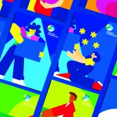
| DESIGN NAME: PepsiCo Foundation PRIMARY FUNCTION: Identity System INSPIRATION: After a bit of research, we identified a greater opportunity. Like many nonprofits that put most of their resources into program work, design tends to be done on a project by project basis. The organization didnt have a strong or consistent visual language that could identify volunteers. We felt there was a need for empathy. To touch people emotionally. To powerfully communicate the issues PepsiCo Foundation tackles. To get people involved in the difficult work of helping others. UNIQUE PROPERTIES / PROJECT DESCRIPTION: In Latin America, the PepsiCo Foundation is a nonprofit focused on investing in communities to help them thrive. This is a mission of empathy and equity. However, the foundation had an identity that was strongly influenced by a corporate visual language. Our mission is to support their mission by developing a more human identity for the PepsiCo Foundation. OPERATION / FLOW / INTERACTION: Internally, the new identity was so well received that its scope of implementation increased dramatically. This started out as a regional identity for Mexico. Then it expanded to LatAm. Not there is conversations happening about making it the global identity too. They saw an increase in volunteer donations which translated into programs that had a positive impact for half a million people. And that is just since the new identity launched in 2020. 14 Million food portions were distributed all over Mexico. Employee contribution was multiplied by 14 for water and food security to different communities. PROJECT DURATION AND LOCATION: Launch Date: DEC 2020 Mexico City with possibilities to be expand to LATAM and Global FITS BEST INTO CATEGORY: Graphics, Illustration and Visual Communication Design |
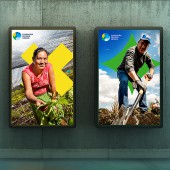
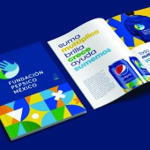
PRODUCTION / REALIZATION TECHNOLOGY: For this Identity System, the final delivery will be a digital brandbook and some merch materials for each event such as tshits, bags, hats, etc. SPECIFICATIONS / TECHNICAL PROPERTIES: There are not packaging deliveries TAGS: PepsiCo, Foundation, identity, system, strong, consistency RESEARCH ABSTRACT: Our solution was simple. It is all about action. Putting things into motion. Think of it in an elemental way. When simple things come together and activate they are the building blocks of bigger, more powerful movements. Our concept was anchored in the idea of Simple Great Help. Then came the visual translation. Archetypal shapes were chosen to identify the three main pillars of the foundation. In this modular system these building blocks multiply and interact to form the greater whole. As levels of complexity expand the possible interaction of the shapes mix and match to create brand expressions as the communication need arises. CHALLENGE: A new colorful, dynamic and appealing system sprouted from all the different interactions creating attractive pattern and textural expressions rooted in a mission driven symbology. We developed a clear geometric typeface and a vibrant color palette. We chose a photography style that highlights both the power of individuals and communities. Inspired by the magnificent, empowered portraits from the muralist Diego Rivera, an illustration style was generated. ADDED DATE: 2021-03-05 16:37:25 TEAM MEMBERS (1) : Innovation Design Center LATAM IMAGE CREDITS: All Images: Design Innovation Center LATAM PATENTS/COPYRIGHTS: Copyrights: PepsiCo International Mexico |
||||
| Visit the following page to learn more: http://www.pepsico.com.mx/ | |||||
| AWARD DETAILS | |
 |
Pepsico Foundation Identity System by Dennis Furniss is Winner in Graphics, Illustration and Visual Communication Design Category, 2020 - 2021.· Read the interview with designer Dennis Furniss for design PepsiCo Foundation here.· Press Members: Login or Register to request an exclusive interview with Dennis Furniss. · Click here to register inorder to view the profile and other works by Dennis Furniss. |
| SOCIAL |
| + Add to Likes / Favorites | Send to My Email | Comment | Testimonials | View Press-Release | Press Kit |
Did you like Dennis Furniss' Graphic Design?
You will most likely enjoy other award winning graphic design as well.
Click here to view more Award Winning Graphic Design.


