OHO Lentil Chips Chips Packaging by Bold Brands |
Home > Winners > #122943 |
 |
|
||||
| DESIGN DETAILS | |||||
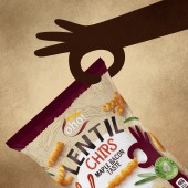
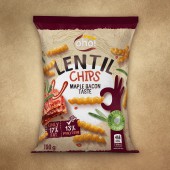
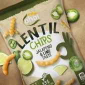
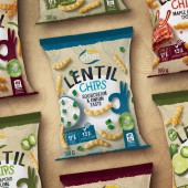
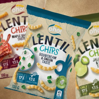
| DESIGN NAME: OHO Lentil Chips PRIMARY FUNCTION: Chips Packaging INSPIRATION: OHO - Lentil chips, healthier snack alternative introduced to lithuanian market by one of the historic local snacks producers. Its a symbol of more natural and healthy snacking. That gave an aspiration to create smooth pastel colour packaging with craft paper texture elements. It was decided to make it playful and attractive to a younger audiences because it is the main target audience of this particular brand. UNIQUE PROPERTIES / PROJECT DESCRIPTION: Main idea of this packaging design is presenting a product as healthier and yet funky alternative to an ordinary snack. Kraft paper background stands out from the crowds of bright and intense colour snack packagings and gives it a touch of natural feel. Illustrated graphic elements gives it more life and connection with a customer and in contrast with that flavouring is communicated through high quality photo images. Combination of these three different design elements makes this product distinguishable, attractive to typical customer of such appetisers and gives it perceptible feel of naturalness. OPERATION / FLOW / INTERACTION: Product is packed in standard bag. It was certainly dictated by consumer habits and convenience. As a matter of fact manufacturer was limited by by packing hardware as well. Task was to create graphical impact rather than select unusual packaging medium. PROJECT DURATION AND LOCATION: This project started in January 2020 February and finished 2020 May. FITS BEST INTO CATEGORY: Packaging Design |
PRODUCTION / REALIZATION TECHNOLOGY: Flexograhy with paper touch varnish. SPECIFICATIONS / TECHNICAL PROPERTIES: 190 x 250 x 50 mm snacks bag printed on popypropylene. TAGS: Chips packaging, Lentil Chips, Chips Packaging Design, Oho Lentil Chips RESEARCH ABSTRACT: Determining the target audience and to make appealing product packaging for that specific audience was of supreme importance. As well as understanding what graphic elements helps consumer to recognize this product as a helthier snacking option at the same time considering what graphic components are easthetically pleasing and provoke a buying decision in the first place. CHALLENGE: It is no secret that snacks category is dominated by vibrant intensive colour packagings. Our task was to create packaging that would communicate healthier choice but with the same taste properties, attracting attention not by the colour intensity but with the playful elements and subtle taste indicating illustrations. ADDED DATE: 2021-03-05 12:19:25 TEAM MEMBERS (3) : Creative Director: Motiejus Gaigalas, Head Of Design: Vytenis Petrusevicius and Graphic Design: Sandra Ramoskaite, Vytenis Petrusevicius IMAGE CREDITS: Visuals: Sandra Ramoskaite |
||||
| Visit the following page to learn more: http://www.boldbrandsagency.com | |||||
| AWARD DETAILS | |
 |
Oho Lentil Chips Chips Packaging by Bold Brands is Winner in Packaging Design Category, 2020 - 2021.· Read the interview with designer Bold Brands for design OHO Lentil Chips here.· Press Members: Login or Register to request an exclusive interview with Bold Brands. · Click here to register inorder to view the profile and other works by Bold Brands. |
| SOCIAL |
| + Add to Likes / Favorites | Send to My Email | Comment | Testimonials | View Press-Release | Press Kit |
Did you like Bold Brands' Packaging Design?
You will most likely enjoy other award winning packaging design as well.
Click here to view more Award Winning Packaging Design.


