Beer Mail by Volfas Engelman Craft Packaging by Bold Brands |
Home > Winners > #122875 |
 |
|
||||
| DESIGN DETAILS | |||||
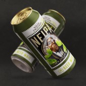
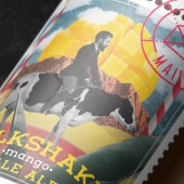
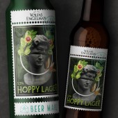
| DESIGN NAME: Beer Mail by Volfas Engelman PRIMARY FUNCTION: Craft Packaging INSPIRATION: The name Beer Mail made us look at the subject of mail. The frame of the stamp was inspired by the idea of the post stamps and how unique it can be, oftentimes even collection worthy. The products are exclusive and produced in small quantities, so we wanted this to be reflected in a design of each label. Every beer type has a unique combination of unexpected flavours that sets the tone for a collage style illustrations combining elements that are inseparable at the first glance. UNIQUE PROPERTIES / PROJECT DESCRIPTION: Exceptional taste beer causes a surprise to your taste buds, and our goals was to convey that same kind of surprise visually. Every label must not only be unique, unusual and not only attract attention but to keep it for a little while. It was important not only to make it attractive but also create the association with the taste at the same time letting the consumer to find ingredients used in making of the beer hidden all over the vivacious illustrations. OPERATION / FLOW / INTERACTION: Beer Mail brand products are produced by one of the biggest local breweries and standard packaging mediums was presented as an only option for the time being. Only challenge was to blend in existing craft beer market as smooth as possible. Therefore 330ml bottles and 500ml cans were selected as the primary packaging. PROJECT DURATION AND LOCATION: This project started in January 2020 and is still ongoing adding a new variety every other month. FITS BEST INTO CATEGORY: Packaging Design |
PRODUCTION / REALIZATION TECHNOLOGY: Bottle labels was produced by digital printing technolgy in brewery. Cans was printed in Can printing house. SPECIFICATIONS / TECHNICAL PROPERTIES: 500 ml cans HD printed. 330 ml glass bottles with labels. TAGS: Craft beer, Beer mail, Alaus laiskai, Collage, Mail, Post Stamp RESEARCH ABSTRACT: Craft beer category is exceptional in the field containing bold package designs and creative illustrations. Big part of labels are exactly that which helps to stand out and highlight the courage of producer as well as unique qualities of product itself. Sometimes even chaotic illustrations helps to reveal that rebellious approach to beer making. One of the most important goals was to find that exclusive style and to make this product noticeable in this challenging market. CHALLENGE: Gentleman is the brand character of Volfas Engelman which is the head brand Beer Mail trademark. And the challenge in this case was to combine this “chatty extrovert” design of craft beer with the gentleman qualities of head brand at the same time avoiding to appear casual and visually similar to a classic beer. Collage graphics together with a postage stamp resembling label was the answer in this case, combining art courage and gentlemenhood into unique visual identity. ADDED DATE: 2021-03-04 14:30:25 TEAM MEMBERS (2) : Creative Director: Motiejus Gaigalas and Graphic Design: Sandra Ramoskaite IMAGE CREDITS: Illustrations & Visuals: Sandra Ramoskaite |
||||
| Visit the following page to learn more: http://www.boldbrandsagency.com | |||||
| AWARD DETAILS | |
 |
Beer Mail by Volfas Engelman Craft Packaging by Bold Brands is Winner in Packaging Design Category, 2020 - 2021.· Press Members: Login or Register to request an exclusive interview with Bold Brands. · Click here to register inorder to view the profile and other works by Bold Brands. |
| SOCIAL |
| + Add to Likes / Favorites | Send to My Email | Comment | Testimonials | View Press-Release | Press Kit |

