IT Intelligence Corporate Identity by Jenny Prive |
Home > Winners > #122482 |
 |
|
||||
| DESIGN DETAILS | |||||
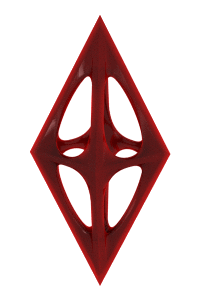
| DESIGN NAME: IT Intelligence PRIMARY FUNCTION: Corporate Identity INSPIRATION: ProContact suffered a dissonance between their brand and their industry. With a name more akin to a dating service than an IT firm, they needed to reconnect with the aesthetics and language of their category. A new name was created: ITI. Functioning bilingually to reflect the acronyms for information technology in both English and French (IT and TI). The logo was built around four rods, with a new identity at its heart: H, to represent the “human”, and their differentiating methodology. UNIQUE PROPERTIES / PROJECT DESCRIPTION: Informatique ProContact provides IT services, and differentiate themselves by going beyond traditional IT methodology — it’s by humans, for humans. We proposed a new name and signature to reflect their approach: ITI. IT Intelligence. Human Intelligence. The logo has been built around four rods, with an H at its heart to represent the “human”. It’s a colourful, bold approach allowing them to stand out from typically conventional IT world branding. OPERATION / FLOW / INTERACTION: During the pandemic, business strategy combined with the launch of the ITI brand doubled annual growth, reaching a 31% increase in comparison to 2019. Customers and the industry recognize that the ITI branding strategy better reflects its leadership and expertise and how the company operates at the core: by humans, for humans. This new identity is also a source of pride for employees and partners within the brand, and acquisition of new qualified marketing subscribers grew to 75% since launch. PROJECT DURATION AND LOCATION: The project started in July 2019 in Montreal and finished in April 2020 in Montreal and was published in Montreal in June 2020. FITS BEST INTO CATEGORY: Graphics, Illustration and Visual Communication Design |
PRODUCTION / REALIZATION TECHNOLOGY: The logo was built around four beams, in reference to the binary ones and zeroes at the foundation of technological processes, with an H representing “human” at its centre, and functions bilingually reflecting the acronyms for information technology in both English and French (IT and TI). Thus, the logo is a multifaceted, and modular expression able to be adapted to the different versions of media bringing the brand to life in a different manner. SPECIFICATIONS / TECHNICAL PROPERTIES: - TAGS: New Brand Identity, IT Industry, Tech Solutions, Corporate Image, Brand Design RESEARCH ABSTRACT: Perception studies revealed that 88% of IT decision-making clients had a positive opinion of ProContact. They emphasized its competence, concrete problem-solving skills, and customer support. However, these same studies revealed a glaring lack of notoriety of the ProContact brand. Only 3% of IT decision makers could recognize them; whereas 30% did not recognize their role. The need to change the name became obvious and to create a clear and compelling brand identity. CHALLENGE: The first challenge included convincing clients to change their brand name as they had built a strong connection to it after 30 years. However, Informatique ProContact was too generic, out-dated and confusing within the category. It was important to equip the brand with a voice that spoke to those in the IT world. A series of webinars launched the brand to clients and business partners, while their popular annual event was taken online, and saw greater attendance than ever. ADDED DATE: 2021-03-01 04:40:58 TEAM MEMBERS (15) : Advertiser: ITI, Client: Jonathan Legault, Client: Noémi Labelle, Client : Andrée-Anne Mauffette, Agency: Forsman & Bodenfors, Creative Director: Eva Van den Bulcke, Art Director: Minh Nguyen, Art Director : Louis Chapdelaine, Art Director : Johan Högdahl, Copywriter: Thimalay Sukhaseum, Copywriter: Elyse Noel de Tilly, Account Services: Jenny Privé, Account Services: Mélanie Beaudoin, Print Production: Stéphane Crépeau and IMAGE CREDITS: Jenny Prive, 2020. |
||||
| Visit the following page to learn more: https://iti.ca/en/ | |||||


| CLIENT/STUDIO/BRAND DETAILS | |
| NAME: Forsman & Bodenfors PROFILE: Forsman & Bodenfors is a global creative collective, founded in Sweden in 1986. Our truly collaborative way of working has over the years unlocked continuous creative excellence and built unusually human brands. |
|

| AWARD DETAILS | |
 |
It Intelligence Corporate Identity by Jenny Prive is Winner in Graphics, Illustration and Visual Communication Design Category, 2020 - 2021.· Press Members: Login or Register to request an exclusive interview with Jenny Prive. · Click here to register inorder to view the profile and other works by Jenny Prive. |
| SOCIAL |
| + Add to Likes / Favorites | Send to My Email | Comment | Testimonials | View Press-Release | Press Kit |