Happetsy Brand Identity by Anamarija Leljak |
Home > Winners > #122375 |
 |
|
||||
| DESIGN DETAILS | |||||
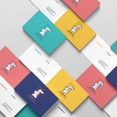
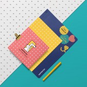
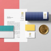
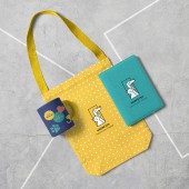
| DESIGN NAME: Happetsy PRIMARY FUNCTION: Brand Identity INSPIRATION: The inspiration came from the overflow of positivity that humans experience when they come home to their pets after a long day at work. Visual idea was framed by modern-retro aesthetics, as this was found to be resonating most with the target audience. Since the main goal was to create a cute brand identity, the visual story portrays happy pets that enjoy each other's company while jumping out of the box. Smiling, cartoonish, fatty look of the pets was an inspiration to boost positive emotions UNIQUE PROPERTIES / PROJECT DESCRIPTION: The uniqueness in Happetsy brand design lies in simplicity, and in the playful game of the old-school retro style with elements of modern design minimalism. Retro style is embodied in the color palette, handwritten typeface, and polka dot patterns. On the other hand, the clean design, layouts, empty spaces, and sans serif typeface are framing the retro brand look with a fresh modern touch. OPERATION / FLOW / INTERACTION: The brand manual was provided as a guide for the client in order to be able to show a consistent brand story. Usage of a retro dot pattern & catchy retro colors across all the media creates a recognizable brand appearance. In this way target audience is able to connect and recognize the brand even without seeing the logo. PROJECT DURATION AND LOCATION: The project started in March 2019 and finished in May 2019 in Denmark. FITS BEST INTO CATEGORY: Graphics, Illustration and Visual Communication Design |
PRODUCTION / REALIZATION TECHNOLOGY: All the graphics were made in Adobe Illustrator to remain the vector quality. The logo design was made based on the Golden Ratio rule in order to appear in the most appealing way. Final designs were delivered in RGB, CMYK, and Pantone colors in order to keep the brand color appearance consistent throughout all media. SPECIFICATIONS / TECHNICAL PROPERTIES: Thank you cards are printed on matte paper of 200g. These printing decisions were made in order to present the brand product offer. Happetsy offers quality and yet affordable products. In order to keep the brand's visual story coherent, all the graphics and illustrations were vectorized and saved as print-ready files. TAGS: Visual identity, Logo Design, Stationery, Playful Branding, Pets, Merchandise RESEARCH ABSTRACT: Target audience, Millenials living in South-West America have proven to be looking for emotional attachments to the brands, especially in the pet industry. Illustrative logo, and modern-retro look, have been identified to deliver this message across. In order to evoke positive feelings, and paint the main brand value - happiness, the logo consists of an organic part (pleasant illustration of a cat and dog) and the rectangle that carries the meaning of stability, and loyalty in American culture. CHALLENGE: Duration of the shipping and non-sustainable production were the main company challenges, translating to the identity design that had to express trust, loyalty, and connection to end customers and create an emotional bond. ADDED DATE: 2021-02-28 21:31:43 TEAM MEMBERS (1) : IMAGE CREDITS: Image #1: Creator: Anamarija Leljak, Logo design,2019. Image #2: Creator: Anamarija Leljak, Business Cards, 2019. Image #3: Creator: Anamarija Leljak, Logo Golden Ratio, 2019. Image #4: Creator: Anamarija Leljak, Stationery design, 2019. Image #4: Creator: Anamarija Leljak, Merchandise, 2019. |
||||
| Visit the following page to learn more: https://bit.ly/2Mw360W | |||||
| AWARD DETAILS | |
 |
Happetsy Brand Identity by Anamarija Leljak is Winner in Graphics, Illustration and Visual Communication Design Category, 2020 - 2021.· Read the interview with designer Anamarija Leljak for design Happetsy here.· Press Members: Login or Register to request an exclusive interview with Anamarija Leljak. · Click here to register inorder to view the profile and other works by Anamarija Leljak. |
| SOCIAL |
| + Add to Likes / Favorites | Send to My Email | Comment | Testimonials | View Press-Release | Press Kit |
Did you like Anamarija Leljak's Graphic Design?
You will most likely enjoy other award winning graphic design as well.
Click here to view more Award Winning Graphic Design.


