DESIGN NAME:
Journey to Cloud Culture and Art
PRIMARY FUNCTION:
Canteen
INSPIRATION:
The concept of staff canteen has gradually evolved from the ancient corridor meal and the western cold food before meal. The diversity of space often depends on the strength of class, which has the characteristics of the times. The design inspiration of this case comes from the exploration of the space elements of the canteen. With the grid design thinking, the design is implanted from the line of sight and streamline.
UNIQUE PROPERTIES / PROJECT DESCRIPTION:
The project is located in the lush area of Lixia District, Jinan, which has always been a central business district. Among them, the staff canteen will serve as the business card of staff catering culture in this area, providing users with dining, negotiation and other functional requirements.
OPERATION / FLOW / INTERACTION:
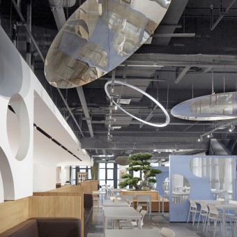
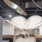
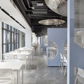
Stepping into the canteen, the striking color attracts people's attention. The mirror ceiling echoes with other indoor elements, guiding people's sight points, breaking the class and distance sense of traditional canteen space. No matter where the diners sit in the canteen, they can have a unique vision and sense of experience.
PROJECT DURATION AND LOCATION:
The project started in December 2019 and finished in October 2020 in Jinan Lixia Holding Group, Shandong Province, China, which is located in the lush area of Lixia District, and always been a central business district.
FITS BEST INTO CATEGORY:
Interior Space and Exhibition Design
|
PRODUCTION / REALIZATION TECHNOLOGY:
The blue of science and technology and the green of nature become the main tone of space. Large area color patches of different shades, plastic materials without time mark, powerful cinematic expression and geometric composition exist in a contactable way.
SPECIFICATIONS / TECHNICAL PROPERTIES:
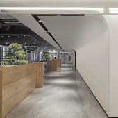
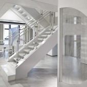
The interaction of large-area artificial stone, metal line and green in space design, with artificial stone as the medium, it sets up an interesting environmental dialogue in the lobby, which makes expression and interaction between lines, materials and colors in serious space. The contrast between light and dark and between virtual and real enriches the artistic atmosphere of space and highlights the artistic phenomenon of ecology and future mission. Retro has always been popular. Designers continue the impression of the 20th century left to the world with eternal elegance and elegant simplicity. Green, blue, yellow, these classic colors, covered with a layer representing the unknown gray, the visual experience is softer. Solid wood, metal mesh, mirror steel and other materials are used for streamlined functional block. Customized seat combination, in line with the ergonomic shape and leather upholstery material, to maximize the comfort of the experience.
TAGS:
grid, relaxed and active, science and technology
RESEARCH ABSTRACT:
The project is located in the lush area of Lixia District, Jinan, which has always been a central business district. Among them, the staff canteen will serve as the business card of staff catering culture in this area, providing users with dining, negotiation and other functional requirements. The design inspiration of this case comes from the exploration of the space elements of the canteen. With the grid design thinking, the design is implanted from the line of sight and streamline.
CHALLENGE:
The difficulty of this design lies in the need to explore the space elements of the staff canteen, and implant the design from the line of sight and streamline. It is necessary to break the sense of hierarchy and sequence of the traditional staff canteen, form a relaxed and active atmosphere with efficient communication, and highlight the artistic phenomenon of ecology and future mission in a serious space.
ADDED DATE:
2021-02-28 15:40:48
TEAM MEMBERS (8) :
Muchuan Xu, Minxi Cai, Zhongning Zhang, Junjie Li, Guanbao Ye, Lanting Li, Zhiwei Li and Xiujuan He
IMAGE CREDITS:
Copyrights belong to Vantree Design, 2021.
PATENTS/COPYRIGHTS:
Copyrights belong to Vantree Design, 2021.
|
