Pride Watch by Alex Donahue |
Home > Winners > #121836 |
 |
|
||||
| DESIGN DETAILS | |||||
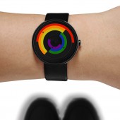
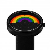
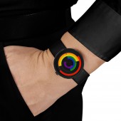
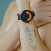
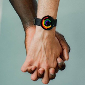
| DESIGN NAME: Pride PRIMARY FUNCTION: Watch INSPIRATION: The pride watch is a timepiece dedicated to those individuals who have bravely stood with pride for the rights of all people. The design is inspired by pride parades that occur annually worldwide, which focus on the global civil rights movement for lesbian, gay, bisexual, transgender, non-binary, and queer social acceptance. UNIQUE PROPERTIES / PROJECT DESCRIPTION: The watch features six colors that continually move about the face. Twice a day, at both noon and midnight, the colors come together to create the shape of a rainbow. Beauty comes in all colors and is heightened by those colors' alignment. Show your pride with this meaningful timepiece. OPERATION / FLOW / INTERACTION: The watch continually transforms as the rainbow bands move about the case to indicate the hour, minute, and second. They align at midnight and noon to form a full rainbow, a symbol of unity. PROJECT DURATION AND LOCATION: Alex Donahue created the conceptual and technical drawings in Fall 2019. The watch began production in Spring 2020 and was released in Summer 2020. It has been bought by design stores and individuals throughout the world. |
PRODUCTION / REALIZATION TECHNOLOGY: The pride watch is unisex. It is made of black stainless steel with hidden lugs that connect the band seamlessly. The watch was developed from a combination of watercolor painting, drawing, technical drawings, and models were made using digital design software. SPECIFICATIONS / TECHNICAL PROPERTIES: The watch weighs .5 lbs, the case's diameter is 40mm and made from Black IP Stainless Steel. The case height is 8.85mm (0.35"). Inside the case, the watch contains a Japanese quartz movement. The watch is water-resistant up to 3 ATM. The band size is 20mm. The band is black and made from leather. TAGS: Pride, LGBTQ+, Rainbow, Unity, Kinetic RESEARCH ABSTRACT: After extensive research on the symbolism of the LGBTQ rights global movement, it was found that the rainbow is the most prevalent symbol. Several design concepts were then created using the rainbow, with the selected option as one in which the hour, minute, and second hands are the rainbow and move about the watch. This was preferred over a graphic application of the rainbow for two reasons: 1. The rainbow would become intrinsic to the function of the watch, 2. The hands come together and form the rainbow, which is a metaphor for unity. CHALLENGE: The design challenge was to create a watch where the primary imagery was part of the watch's function rather than an applied graphic. The hour, minute, and second hands move about the watch, creating varied compositions throughout the day. The watch hands are colorful, but the case and band provide a monochrome, elegant backdrop. ADDED DATE: 2021-02-28 04:09:40 TEAM MEMBERS (1) : Alex Donahue IMAGE CREDITS: All photos copyright: Project Watches |
||||
| Visit the following page to learn more: http://corcoran.gwu.edu/alex-donahue | |||||
| AWARD DETAILS | |
 |
Pride Watch by Alex Donahue is Winner in Jewelry Design Category, 2020 - 2021.· Read the interview with designer Alex Donahue for design Pride here.· Press Members: Login or Register to request an exclusive interview with Alex Donahue. · Click here to register inorder to view the profile and other works by Alex Donahue. |
| SOCIAL |
| + Add to Likes / Favorites | Send to My Email | Comment | Testimonials | View Press-Release | Press Kit |
Did you like Alex Donahue's Jewelry Design?
You will most likely enjoy other award winning jewelry design as well.
Click here to view more Award Winning Jewelry Design.


